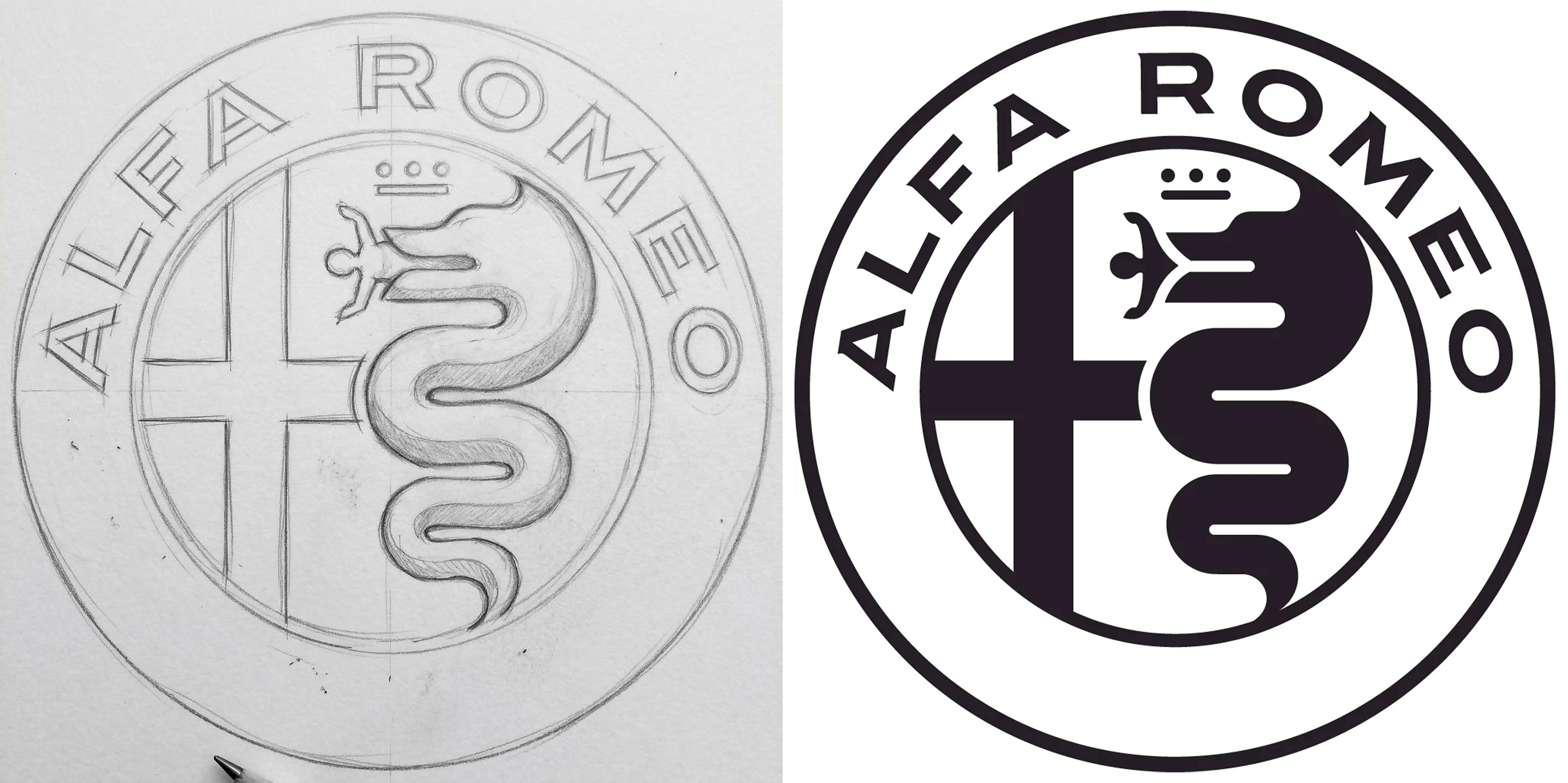
THE CHALLENGE
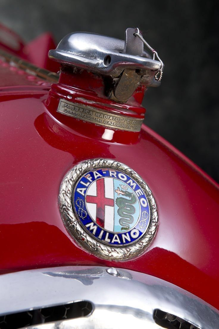
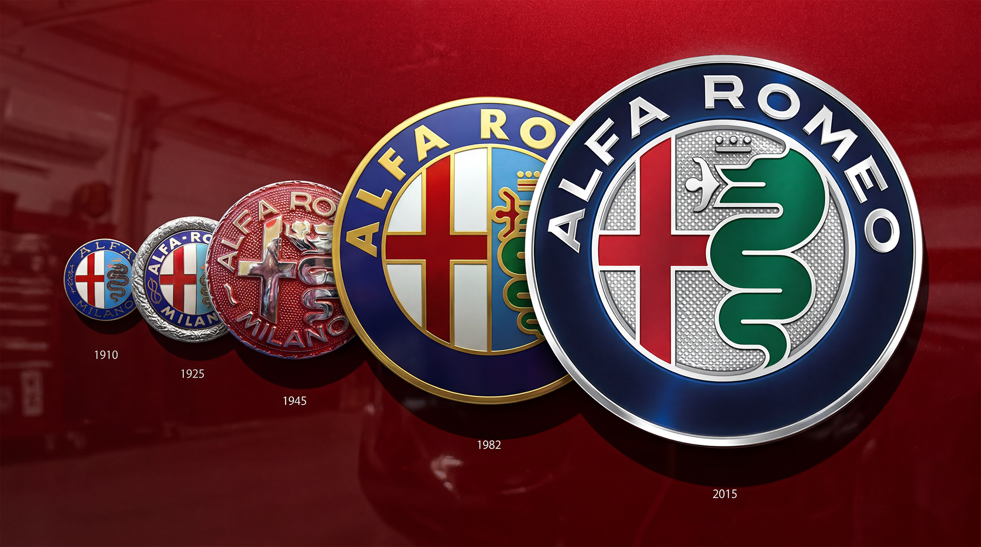
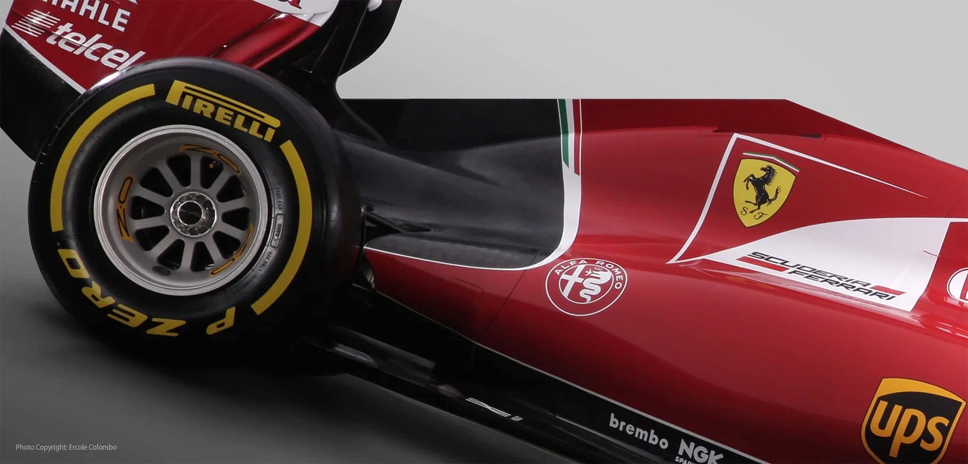
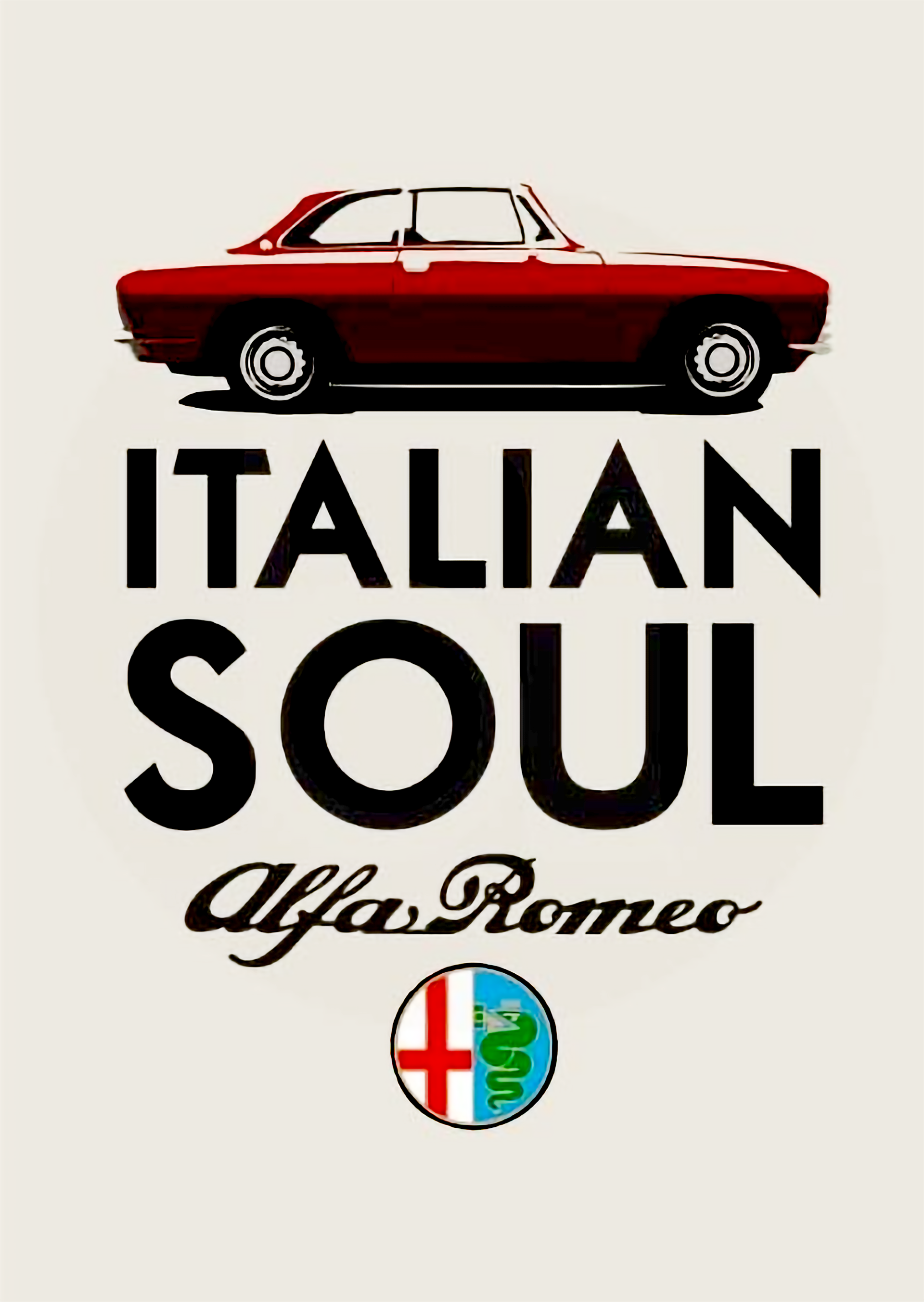
Alfa Romeo’s emblem is one of the most enduring symbols in automotive history, rooted in Milan through the red cross and the Visconti serpent. Unchanged in its fundamentals for decades, it carried deep heritage but risked feeling static.
In 2015, as Alfa Romeo prepared its global relaunch and return to the U.S. with the Giulia, the brand needed a mark that could project relevance on a global stage while preserving its identity.
THE INSIGHT
We started from Alfa Romeo’s core belief: la meccanica delle emozioni.
Emotion in Alfa is engineered. Performance is not just power, but the balance of speed, control and precision.
This is what defines its new design language: swift muscularity—a tension between strength and agility.
The emblem needed to express this. Not heritage alone, but the mechanics behind the emotion.
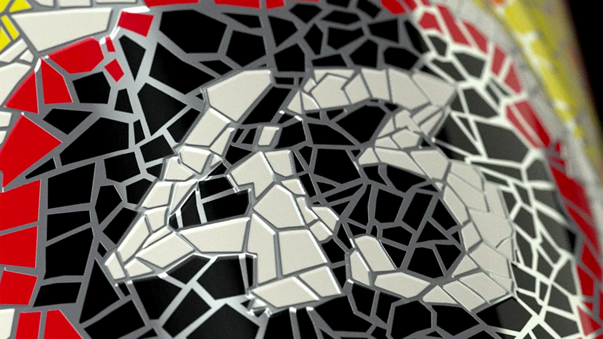
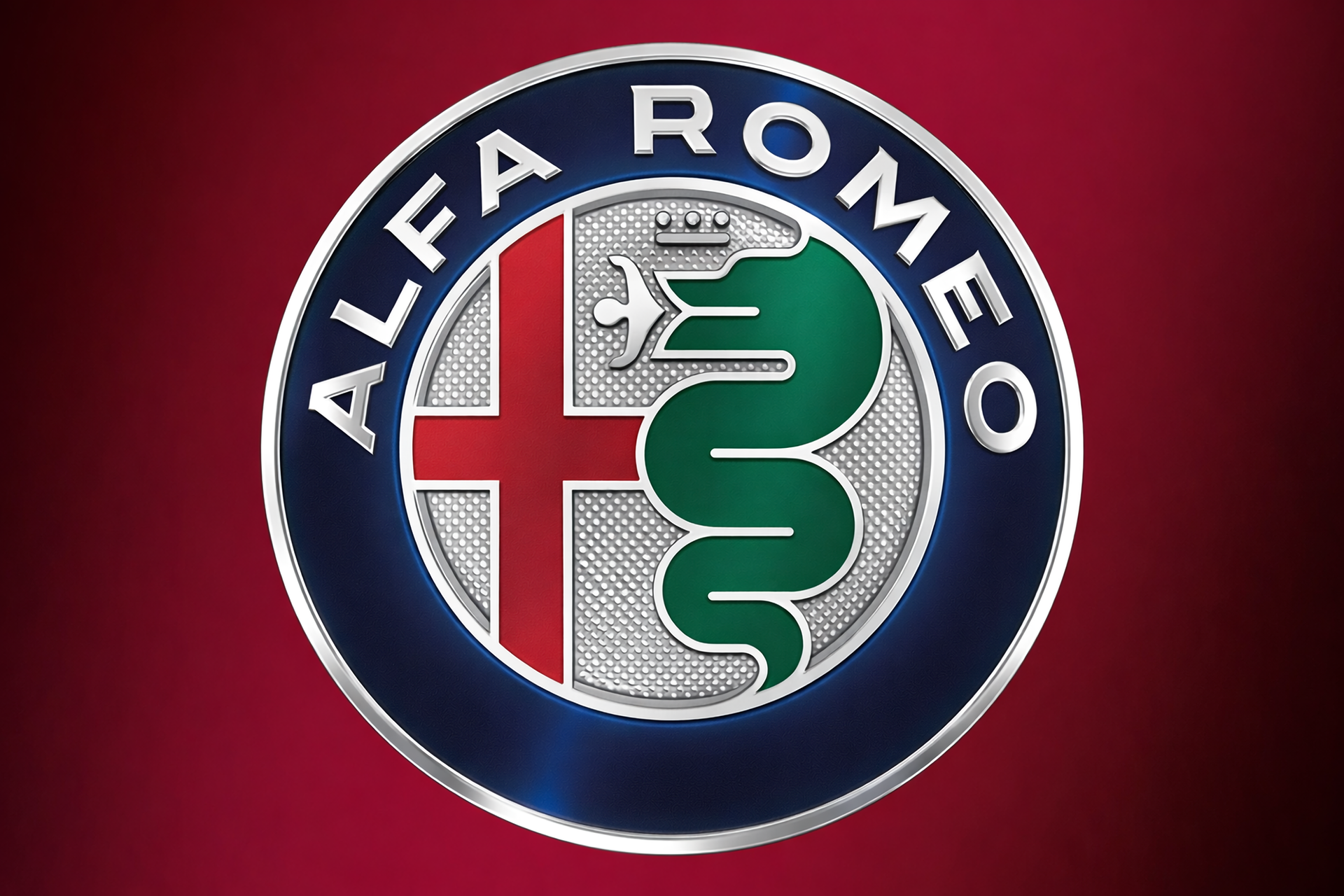
THE OUTCOME
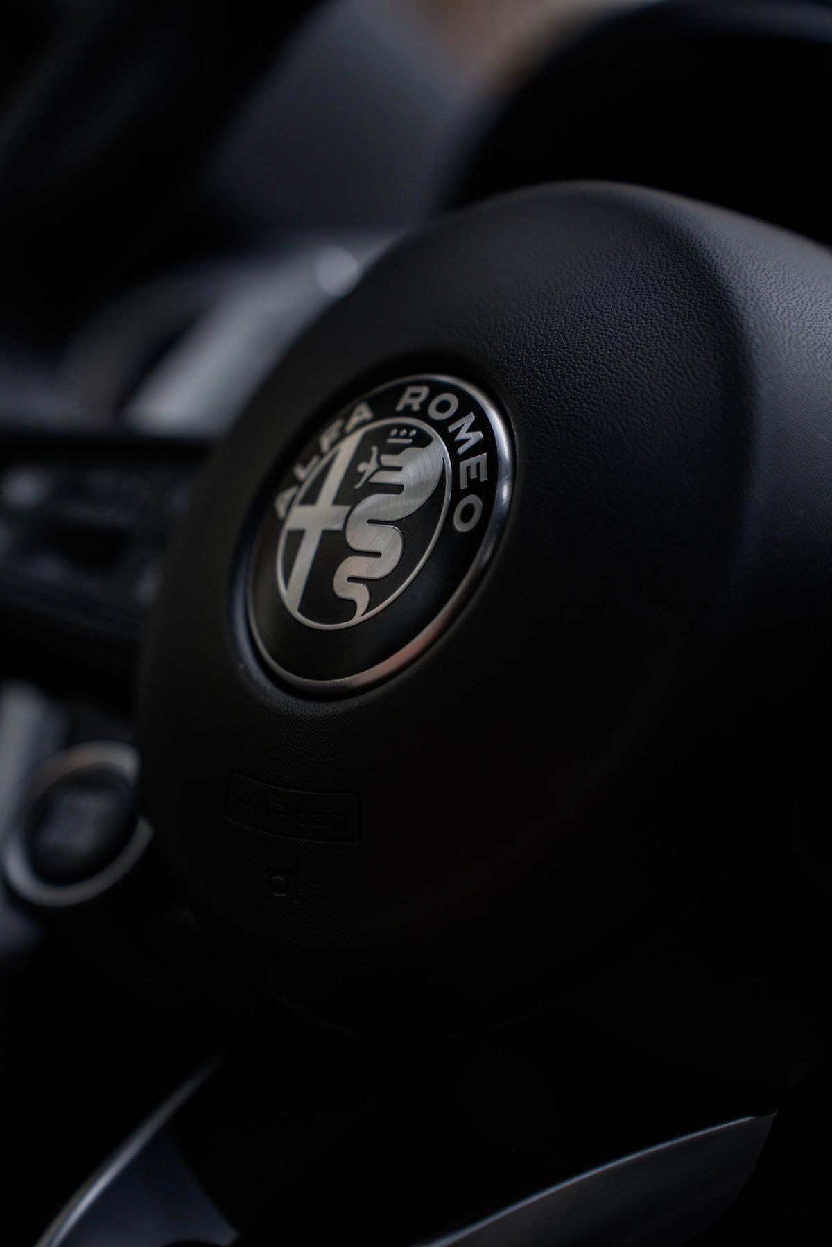
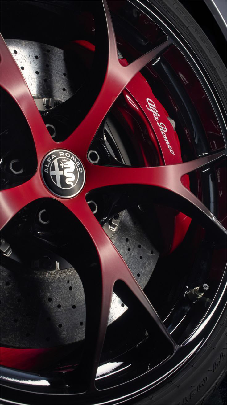
The identity was refined, not reinvented.
Core symbols were preserved, while the design was simplified and sharpened. Colors were reduced, details removed, and forms unified into a more precise and contemporary composition.
The result is a cleaner, more controlled mark that translates Alfa Romeo’s performance language into a visual system—more fluid, more technical, more intentional.
THE IMPACT
The redesign launched alongside the Giulia, the first model of Alfa Romeo’s global relaunch strategy.
The model quickly became the brand’s flagship, peaking at over 11,500 units in the U.S. in 2018 and helping re-establish Alfa Romeo’s presence in the market.
The new identity reinforced the shift: from heritage brand to performance-driven global player.
CREDITS
CLient: THE MAGNUM ICE CREAM COMPANY
Agency: Design bridge and partners
CREATIVE DIRECTOR: FABIO MILITO
STRATEGY DIRECTOR: BIAN JENSEN, ALICIA MITCHELL
DESIGN DIRECTOR: ASHLEIGH LAMBERT
SENIOR DESIGNER: CHRISTINA VOUTETAKI
CLient: THE MAGNUM ICE CREAM COMPANY
Agency: Design bridge and partners
CREATIVE DIRECTOR: FABIO MILITO
STRATEGY DIRECTOR: BIAN JENSEN, ALICIA MITCHELL
DESIGN DIRECTOR: ASHLEIGH LAMBERT
SENIOR DESIGNER: CHRISTINA VOUTETAKI