The challenge
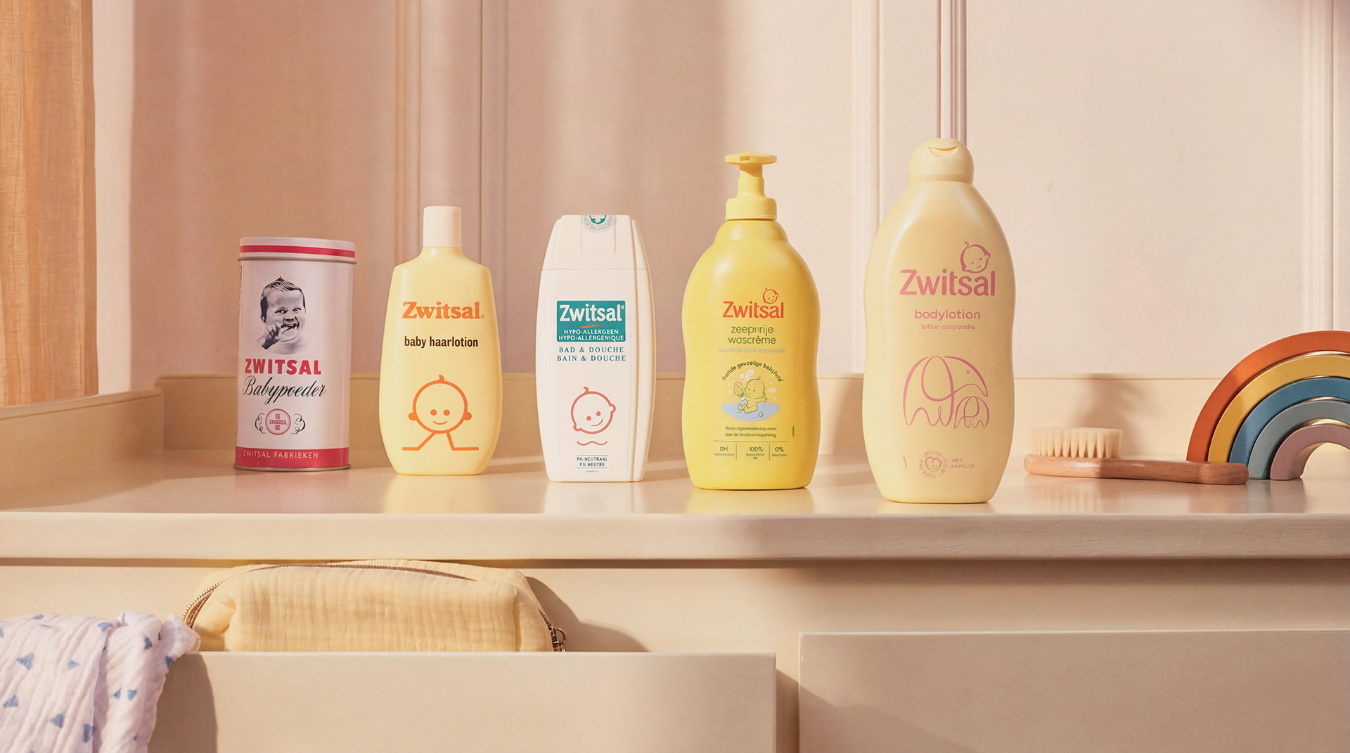
Created over a century ago by a loving pharmacist for his own baby, Zwitsal became one of the most beloved baby care brands in the Netherlands. Its distinctive yellow bottles and signature scent came to symbolise warmth and care, woven into Dutch family life for generations.
Yet as new parents increasingly turned to gentler, more natural alternatives, Zwitsal risked losing its connection with a new generation. The iconic yellow and familiar fragrance were beginning to feel artificial and outdated. The brand needed to reconnect with its tender origins and re-engage modern parents with the softness, protection and emotional bond that had always defined it.
The insight
The earliest moments of life matter most. Responsive touch, soothing rituals and emotional closeness in babyhood build the foundations for lifelong resilience and attachment.
For generations, Zwitsal had quietly been part of these intimate daily moments — from the first bath to bedtime routines.In a world that has become increasingly busy and noisy, these small moments of bonding are more precious than ever.
Zwitsal’s role is not simply functional care, but protecting and cherishing these delicate connections between parent and child.
The outcome
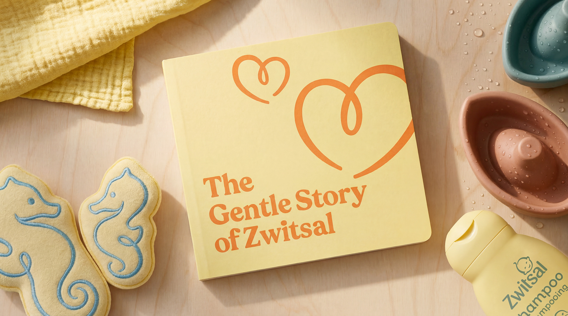
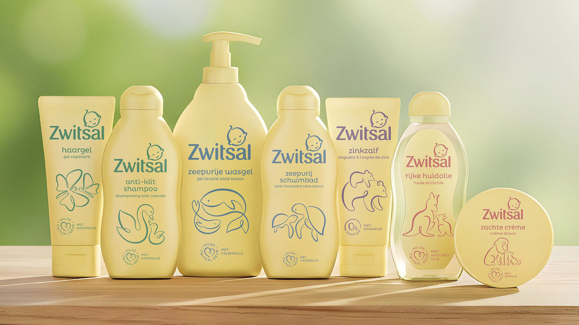
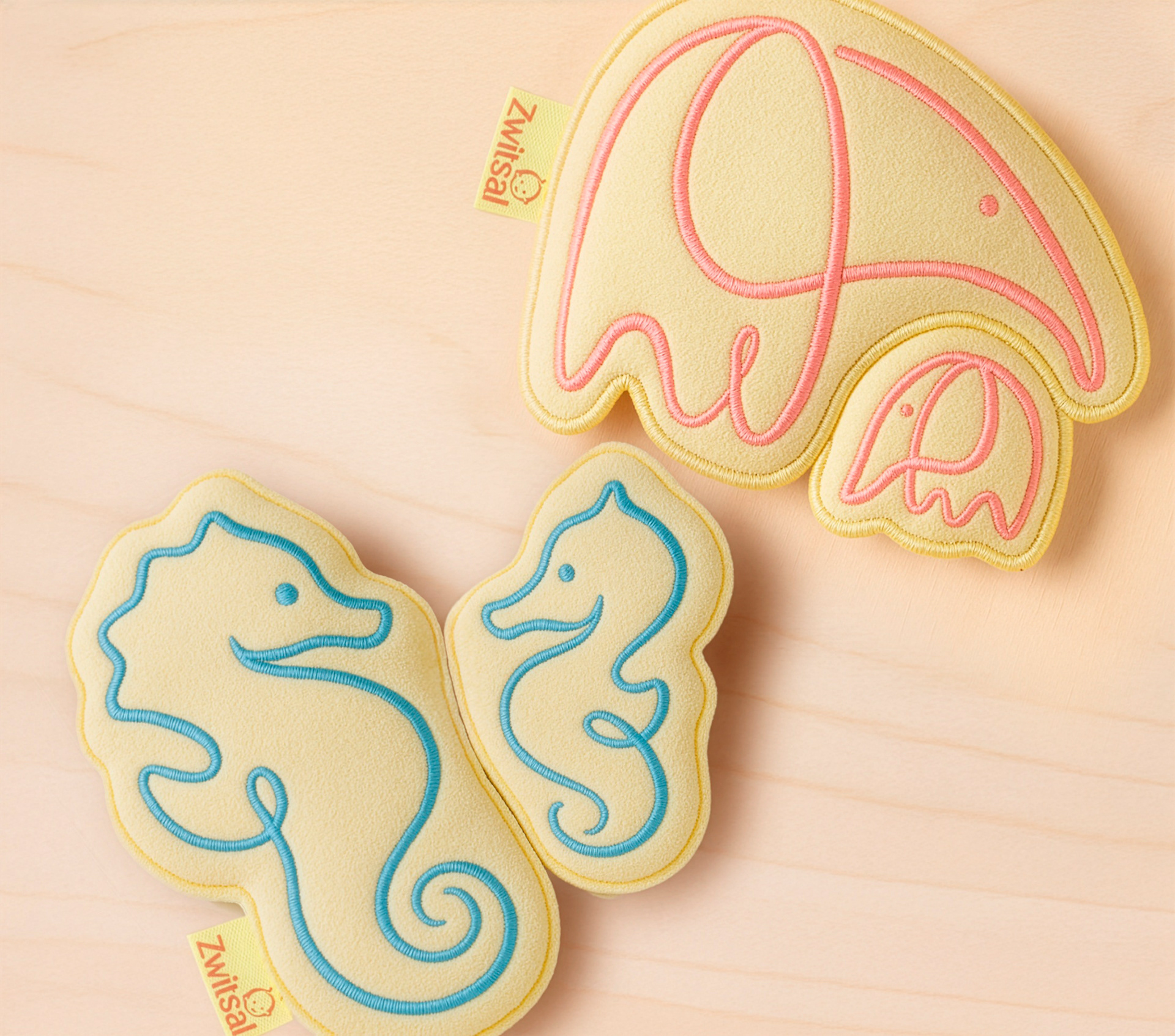
Guided by this insight, we carefully rebalanced every element of the brand to place the soft power of early bonds back at the heart of Zwitsal.The iconic yellow was softened and the fragrance refined to feel lighter while remaining instantly recognisable. We introduced smiling eyes to the beloved “Kleintje” — The Little One — creating an immediate sense of warmth and connection.
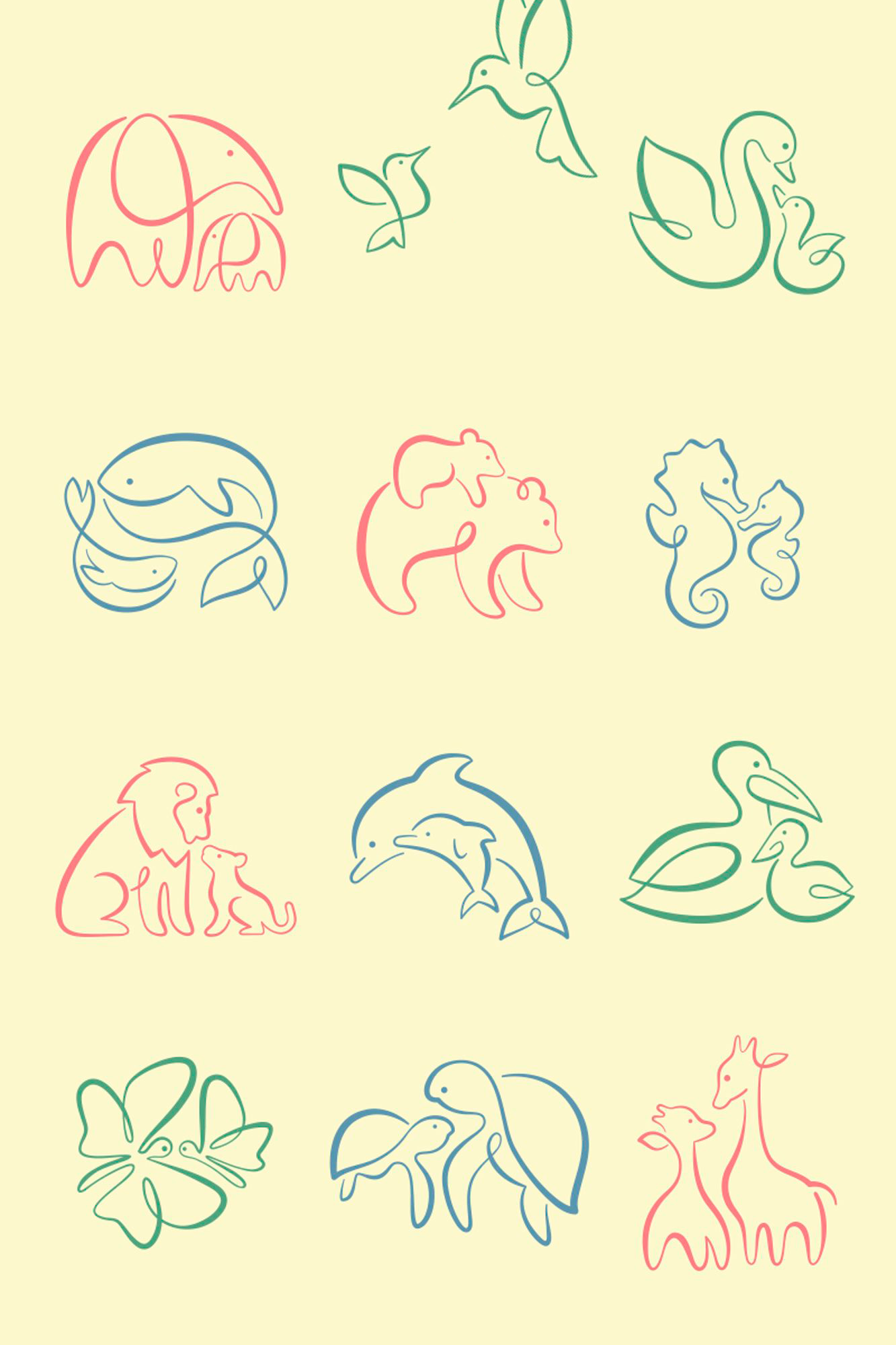
This softness continues through a new typeface and signature, expressed as a gentle calligraphic “bonding thread” that flows through the identity. Bespoke illustrations of parent and baby animals create tender scenes of closeness, ensuring bonding remains at the centre of every touchpoint.
Guided by this insight, we carefully rebalanced every element of the brand to place the soft power of early bonds back at the heart of Zwitsal.The iconic yellow was softened and the fragrance refined to feel lighter while remaining instantly recognisable. We introduced smiling eyes to the beloved “Kleintje” — The Little One — creating an immediate sense of warmth and connection.
This softness continues through a new typeface and signature, expressed as a gentle calligraphic “bonding thread” that flows through the identity. Bespoke illustrations of parent and baby animals create tender scenes of closeness, ensuring bonding remains at the centre of every touchpoint.

The result
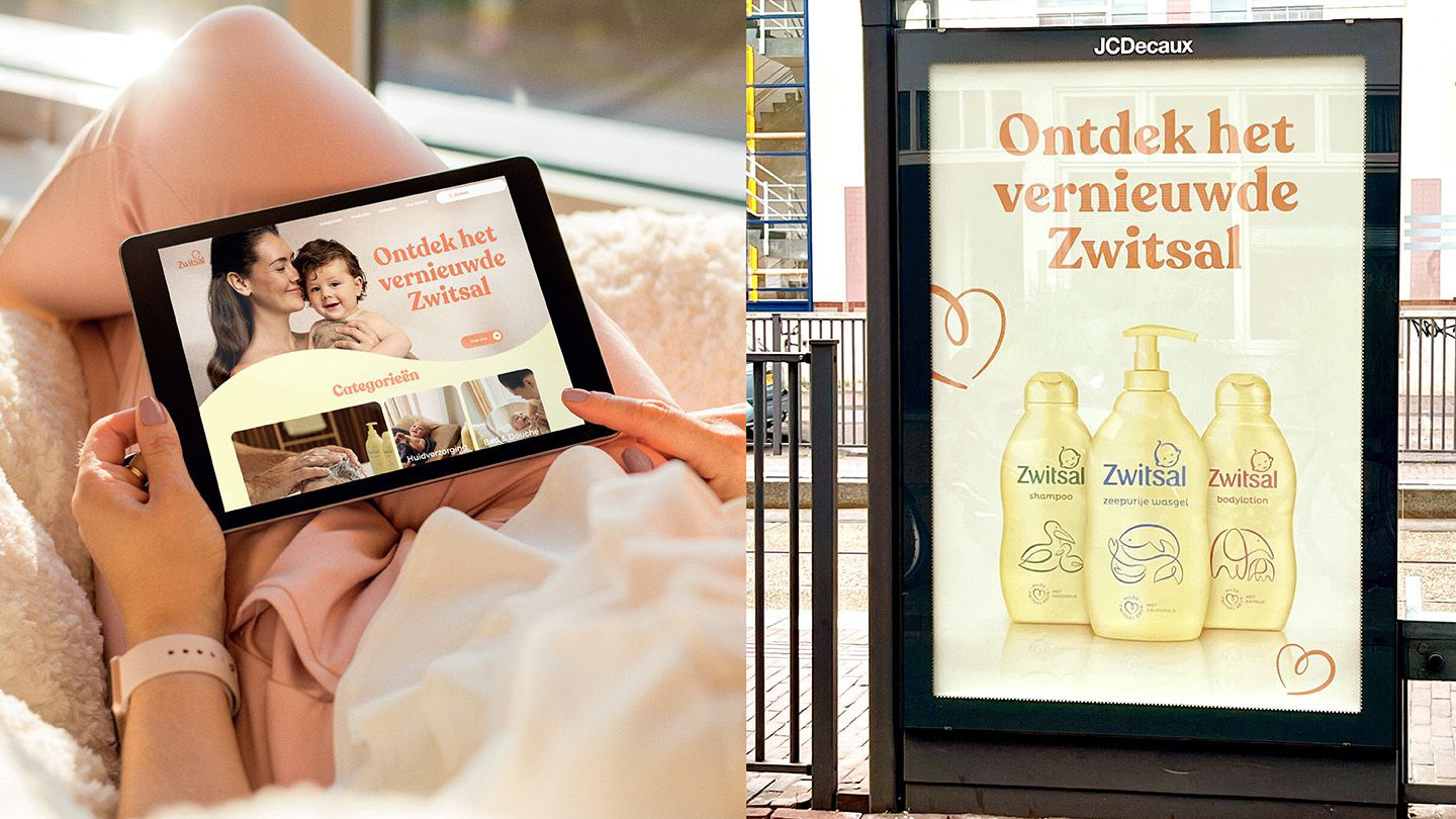
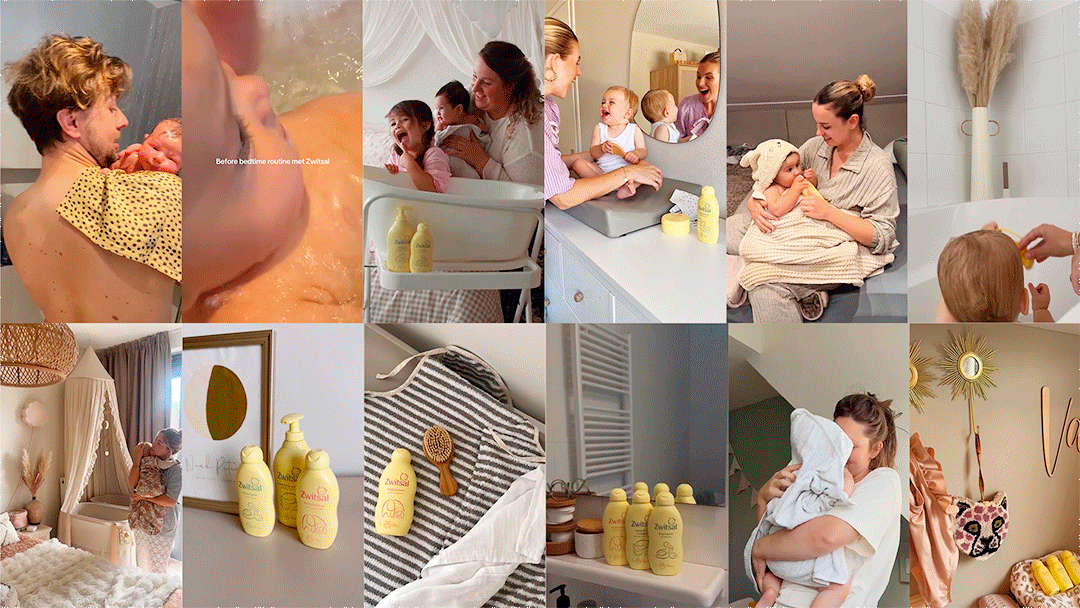
The new identity reconnects Zwitsal with a new generation of parents while strengthening the emotional bond between them and their little ones. It renews the trust and affection that made Zwitsal a Dutch icon.
Softer, more natural and unmistakably Zwitsal, the brand is ready to nurture the next generation of families. A campaign by Ogilvy Amsterdam beautifully brought the rebrand to life.
“Design Bridge and Partners is and has been an outstanding partner in the relaunch of our iconic brand. Your work has gone far beyond aesthetics; you’ve helped us futureproof the brand by translating our positioning into a modern design system. Great strategic thinking, partnership and creative delivery.”
Diana van Staalduijnen
Baby Category Lead,
Unilever
Baby Category Lead,
Unilever
Client: UNILEVER global
DESIGN Agency: Design Bridge and Partners
ADVERTISING AGENCY: OGILVY AMSTERDAM
STRATEGY DIRECTOR: BRIAN JENSEN
Creative DIrector: Fabio Milito
CLIENT BUSINESS DIRECTOR: SYLVIA VAN DUYVENBOODE
Design Director: Jacques Mackay
SENIOR DESIGNER/ILLUSTRATOR: Solvita Mariota
SENIOR CLIENT MANAGER: KRISTYNA SISKOVA