THE CHALLENGE
Heineken had always been an icon of nightlife, but had less relevance in daytime occasions. And while its distinctive green world was unmistakable, its brand assets needed more flexibility and energy to create broader experiences for a younger audience.
Heineken had always been an icon of nightlife, but had less relevance in daytime occasions. And while its distinctive green world was unmistakable, its brand assets needed more flexibility and energy to create broader experiences for a younger audience.
THE INSIGHT
Who said you shouldn’t play with the logo?
Who said you shouldn’t play with the logo?
THE IDEA
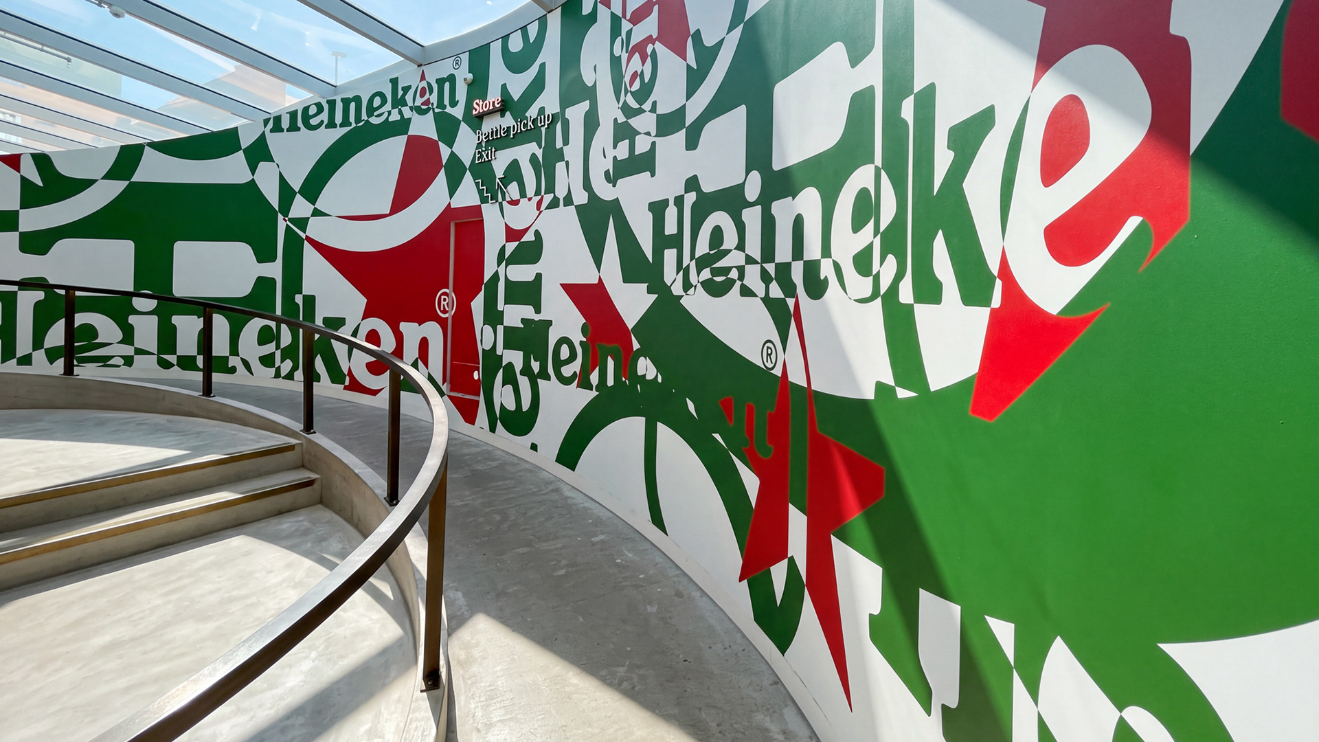
Recharge the icon.
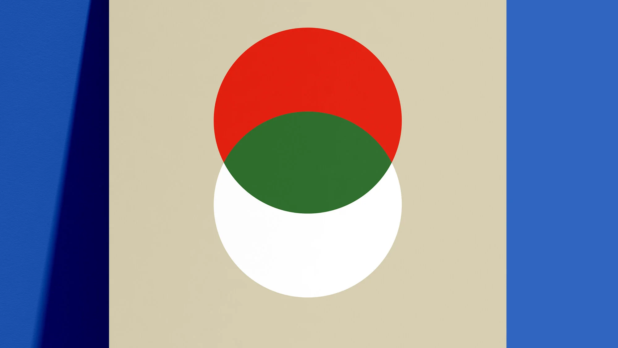
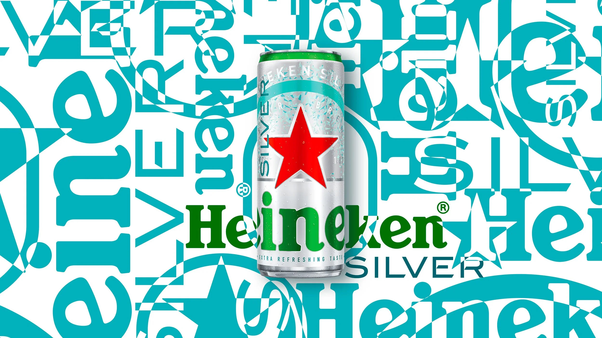
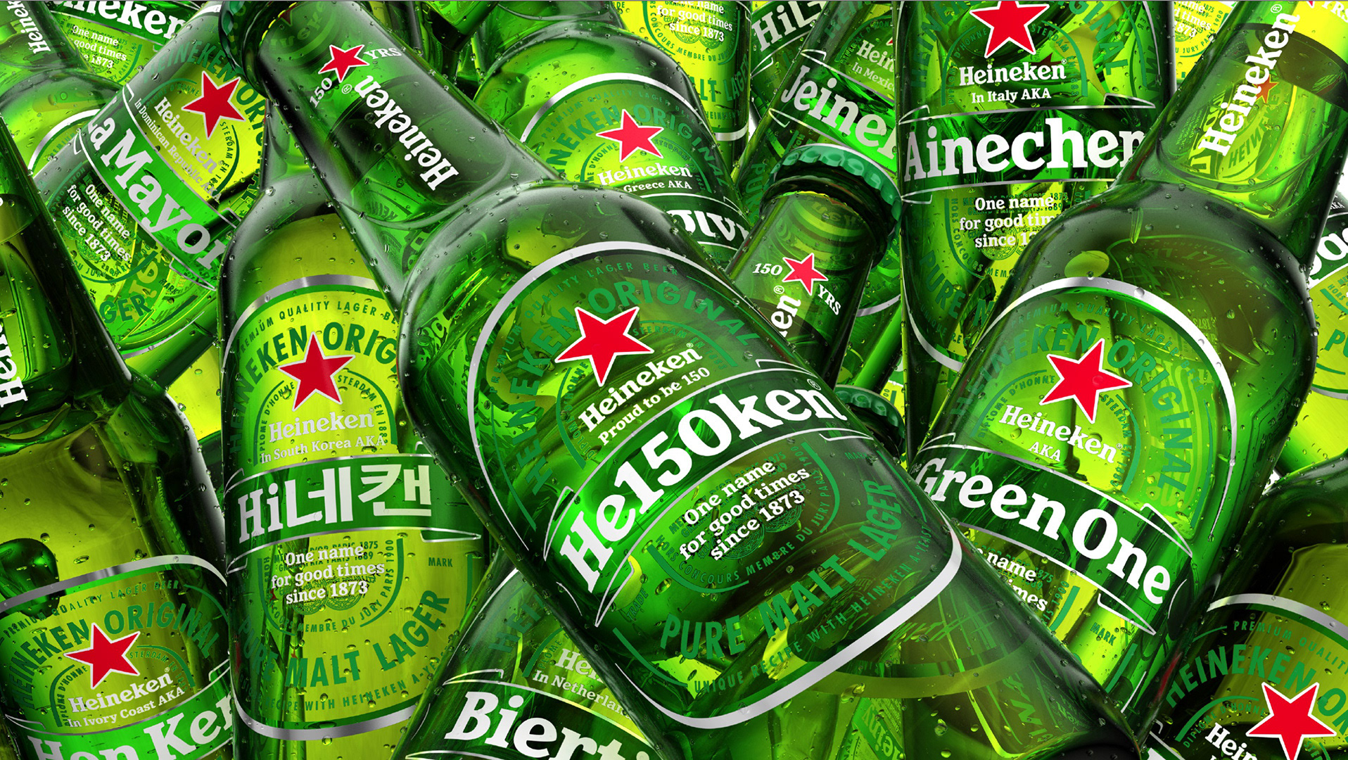
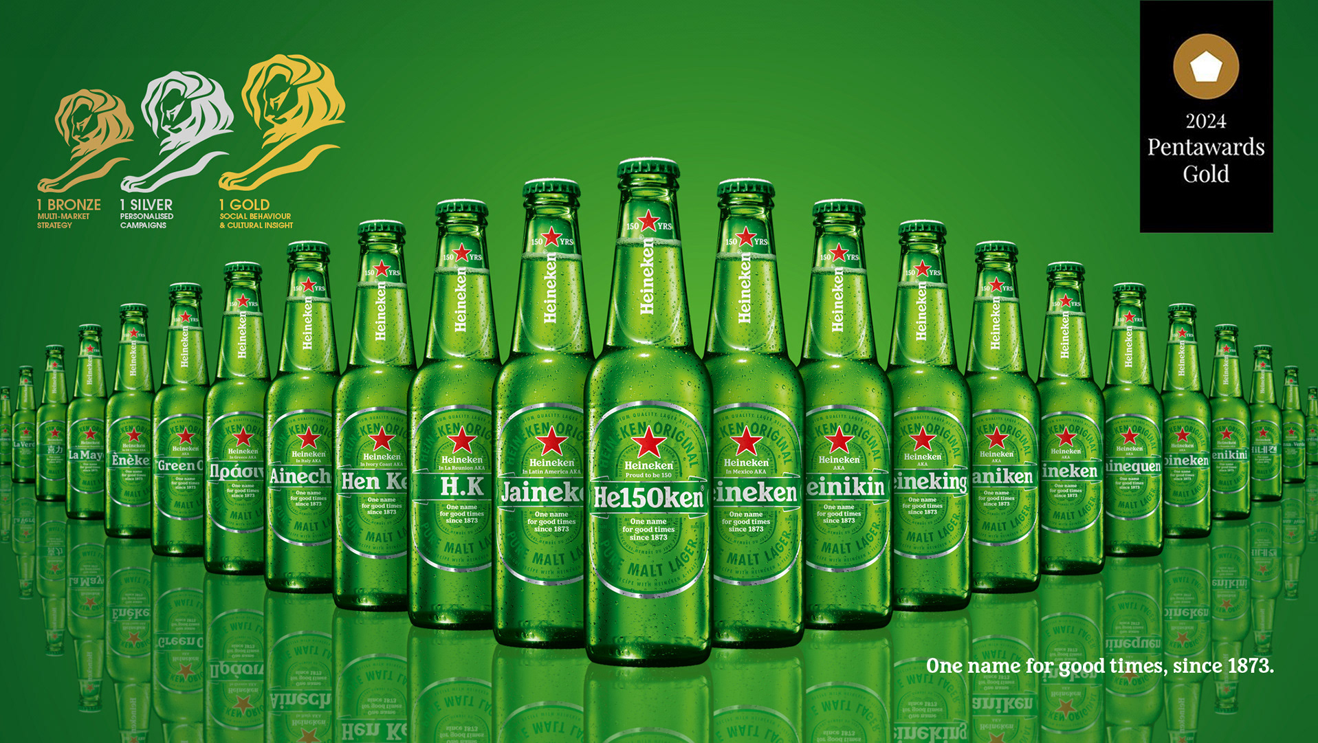
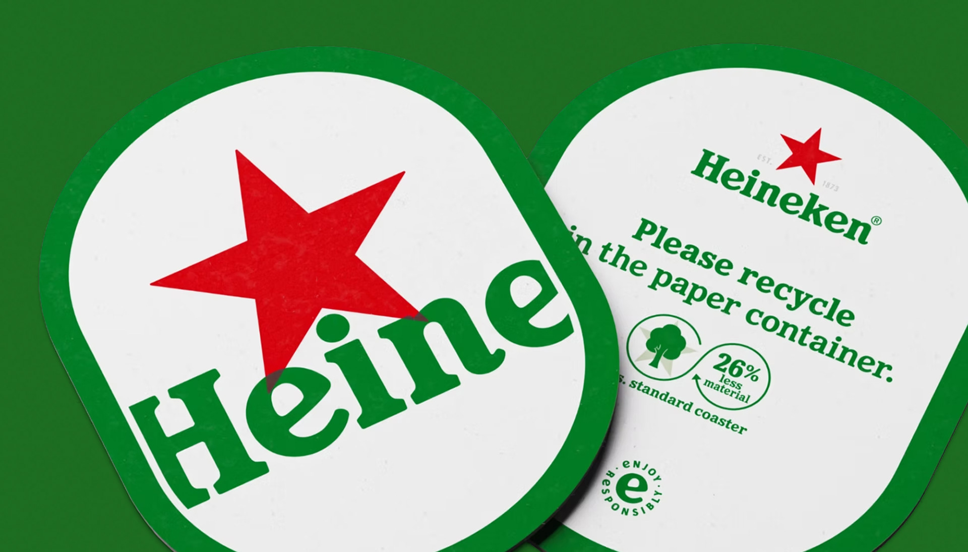
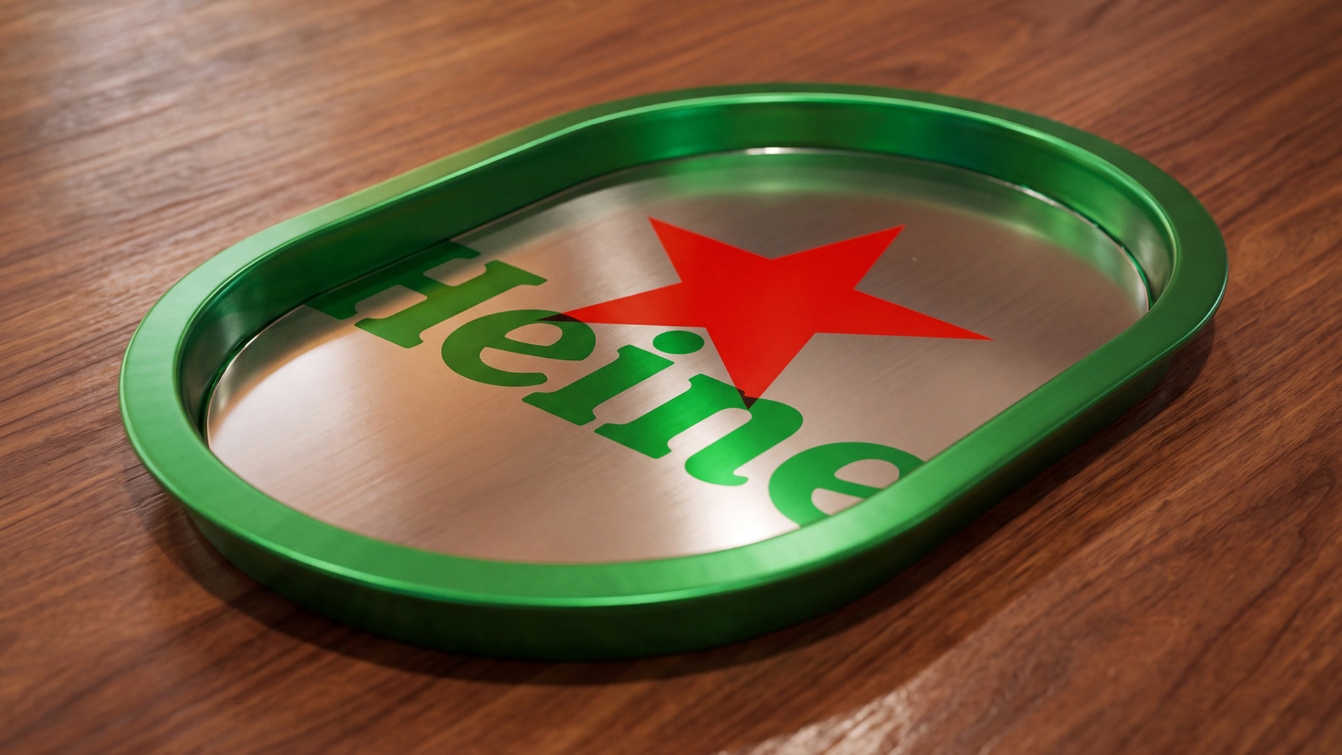
We set Heineken’s distinctive assets free to move, interact and play with each other.
Because icons can.
Recharge the icon.
We set Heineken’s distinctive assets free to move, interact and play with each other.
Because icons can.
THE RESULT
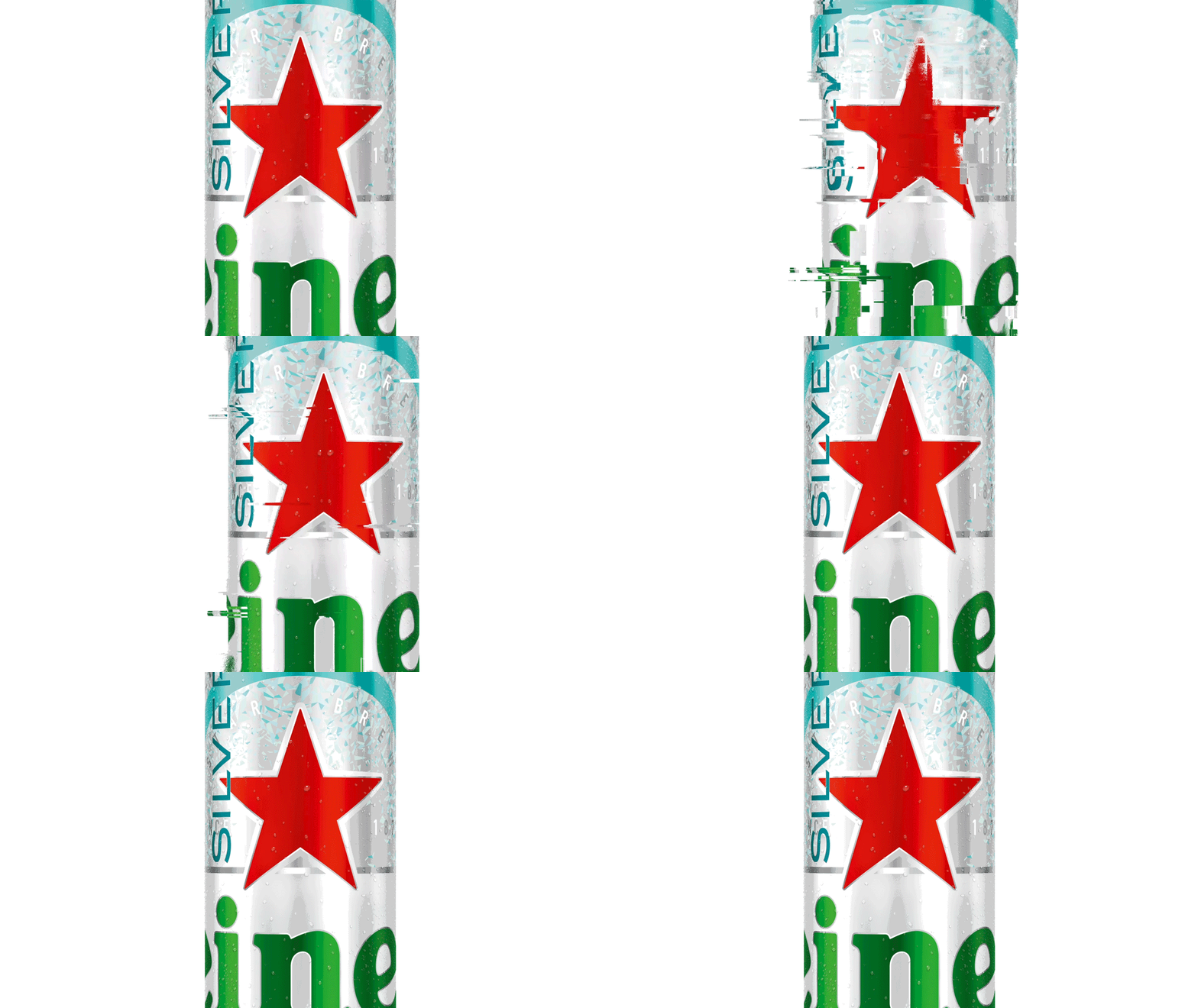
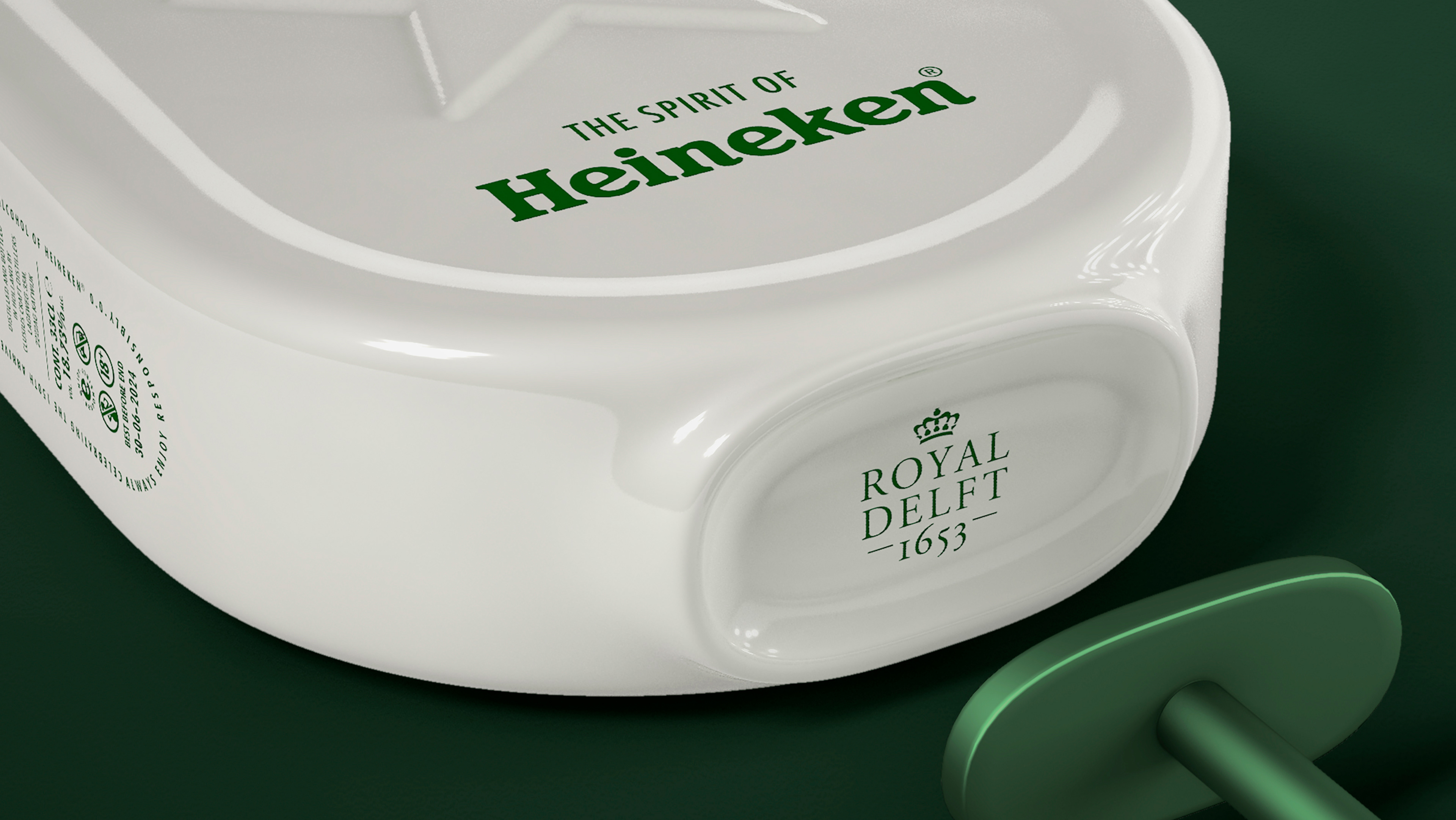
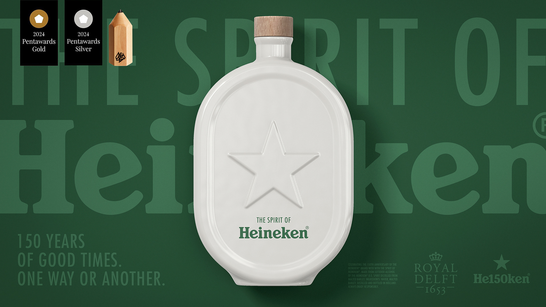
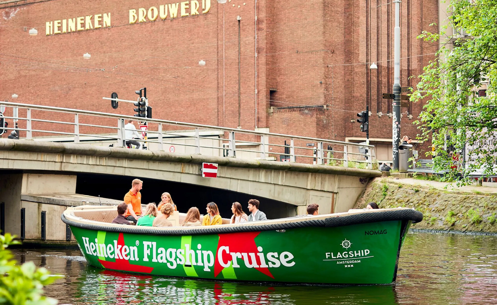
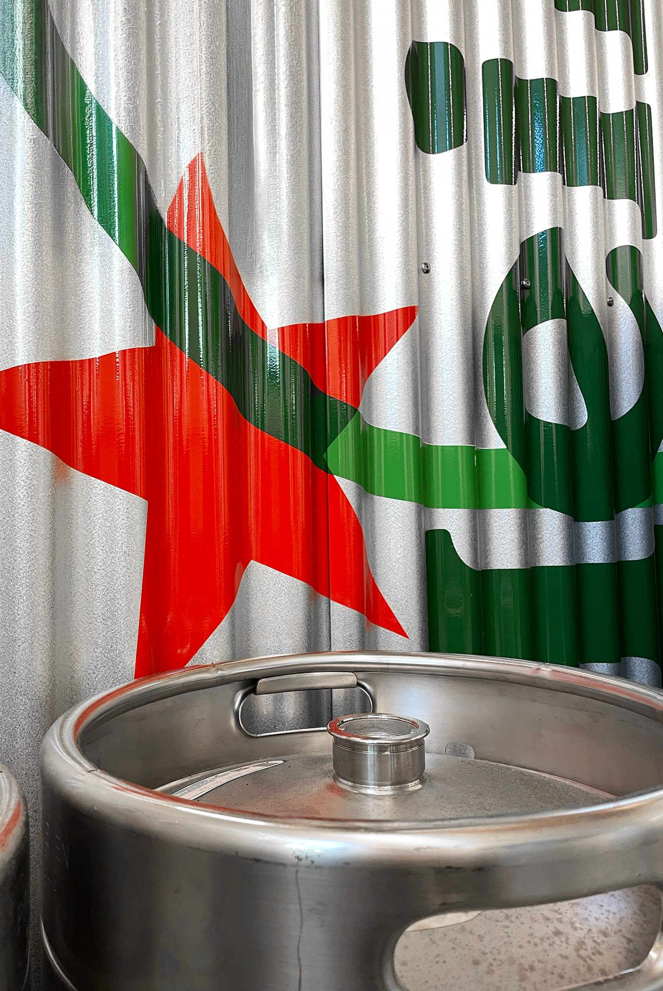
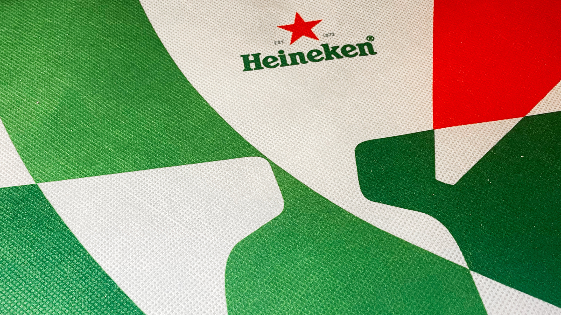
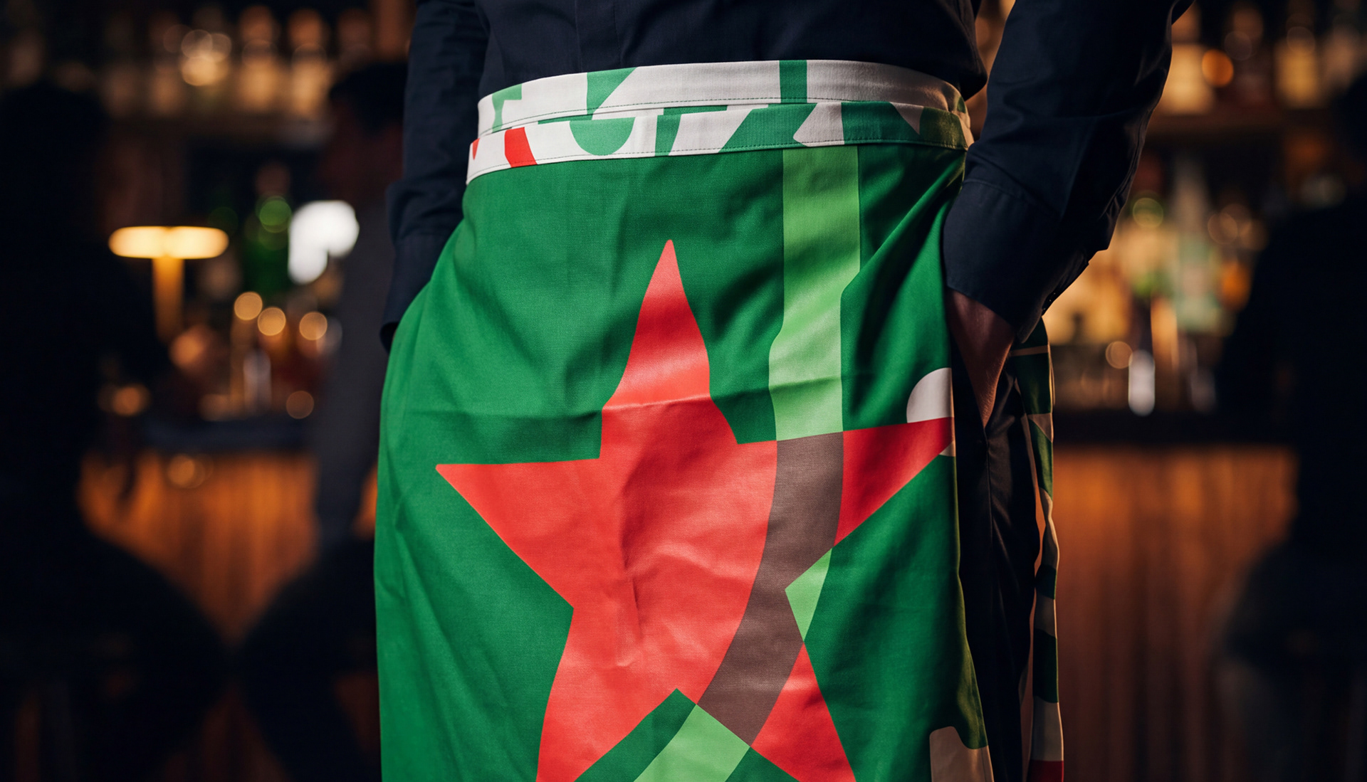
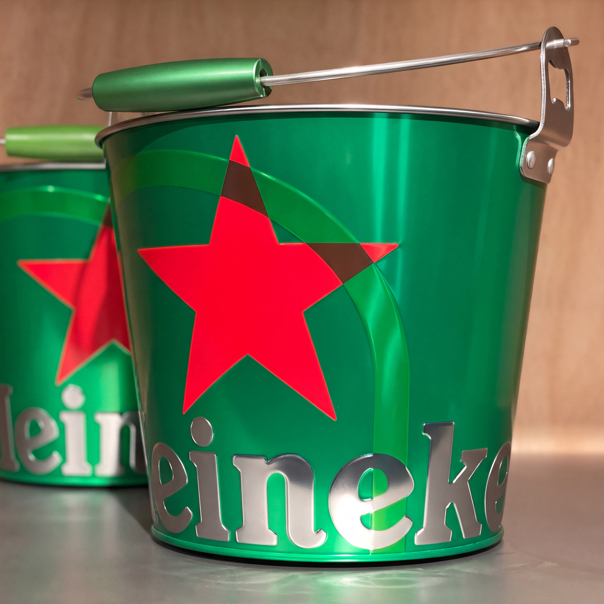
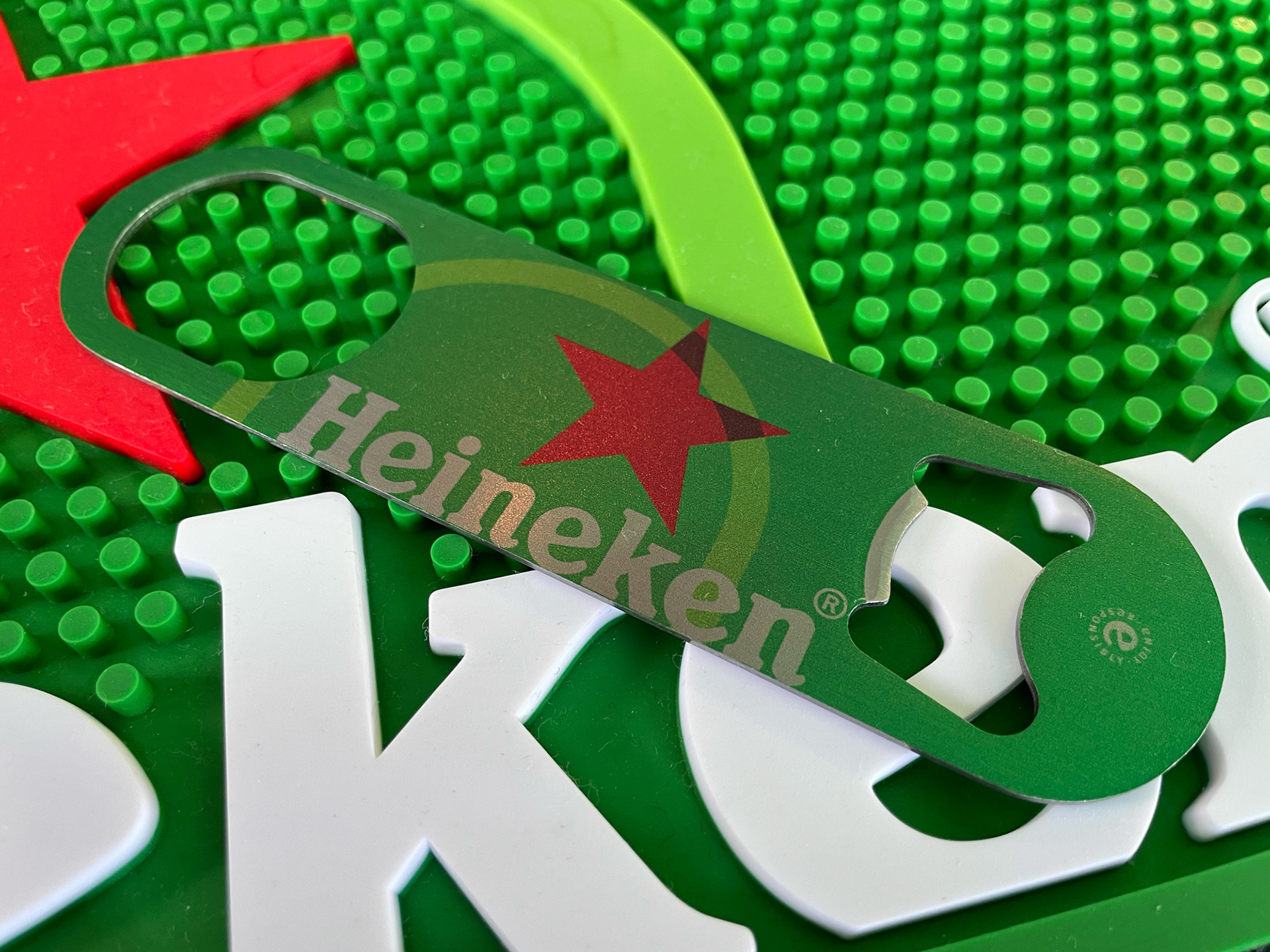
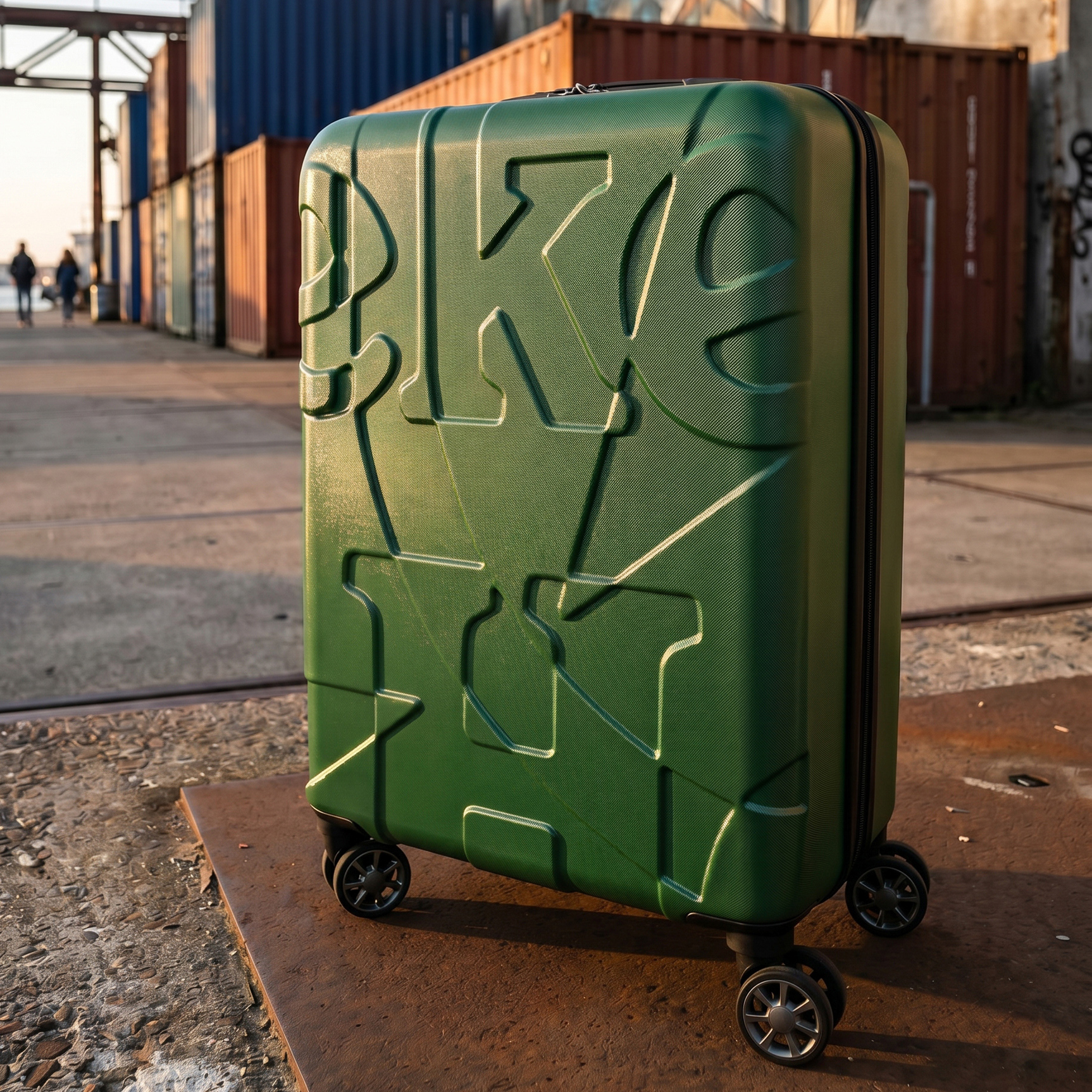
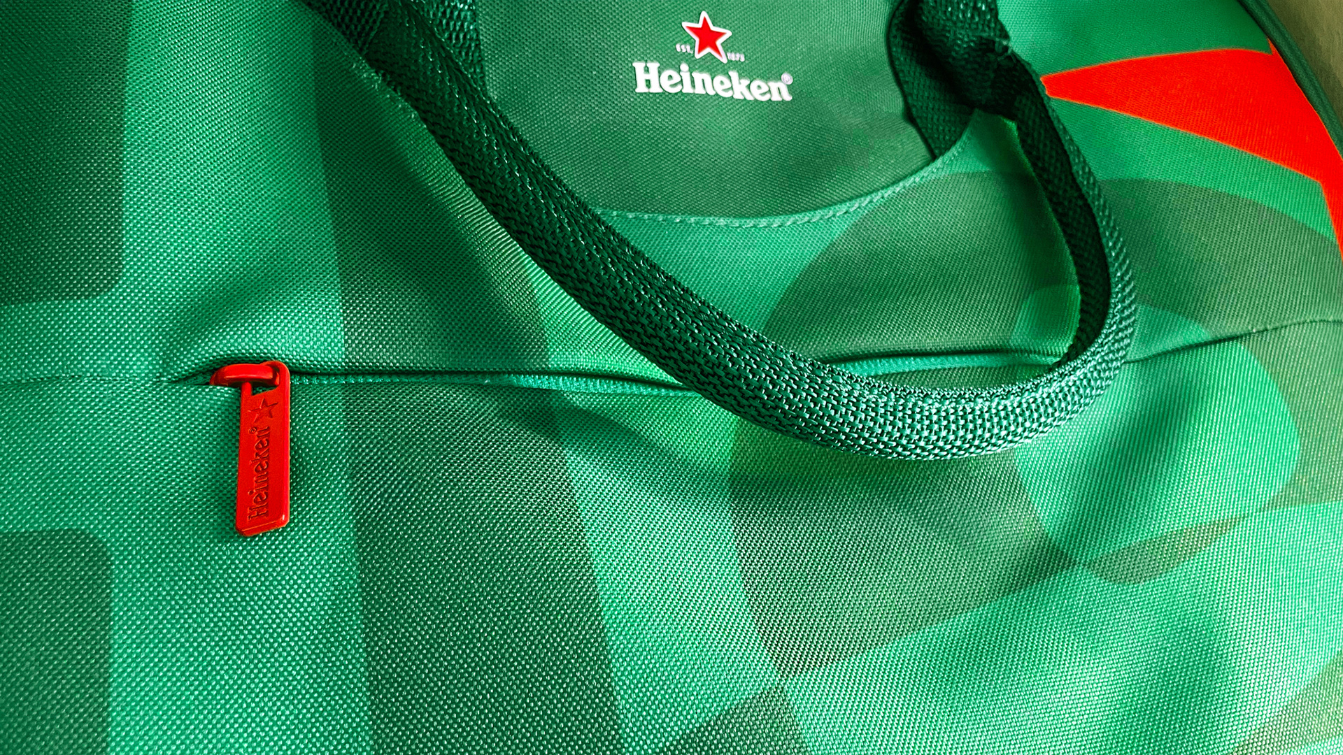
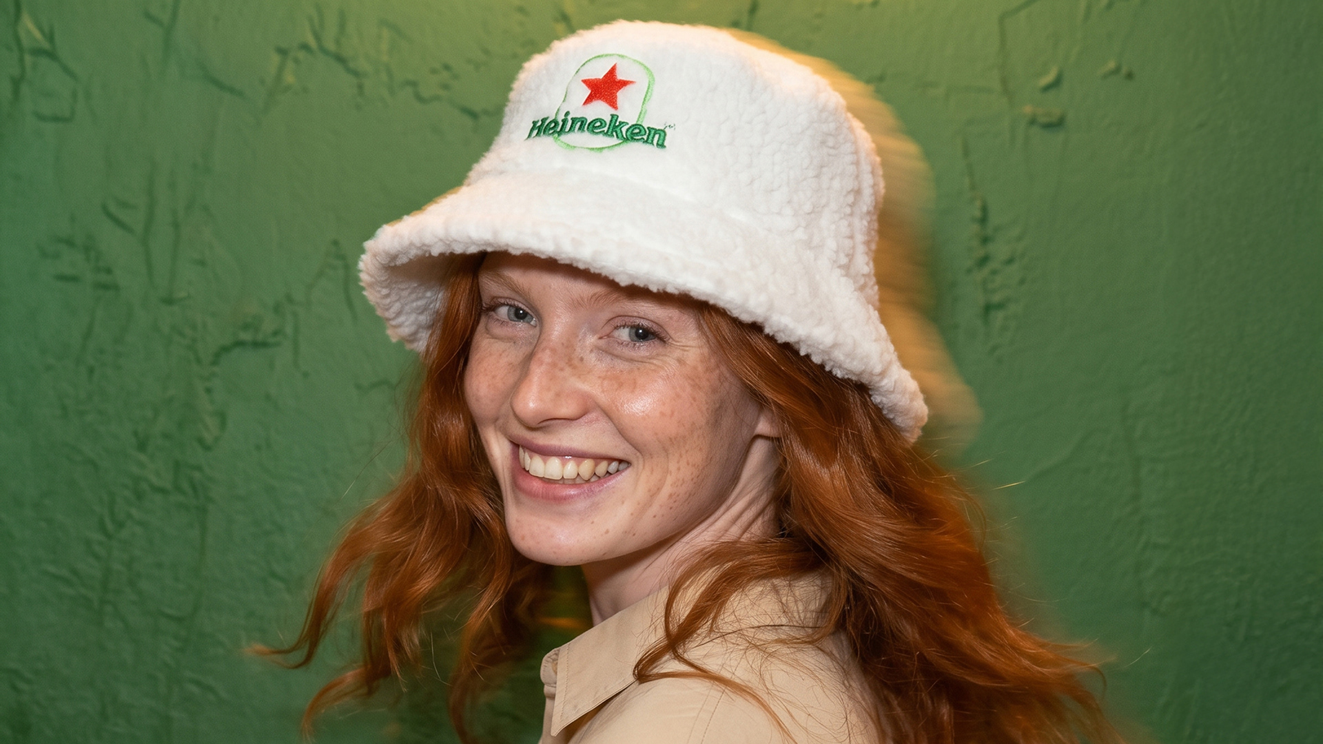
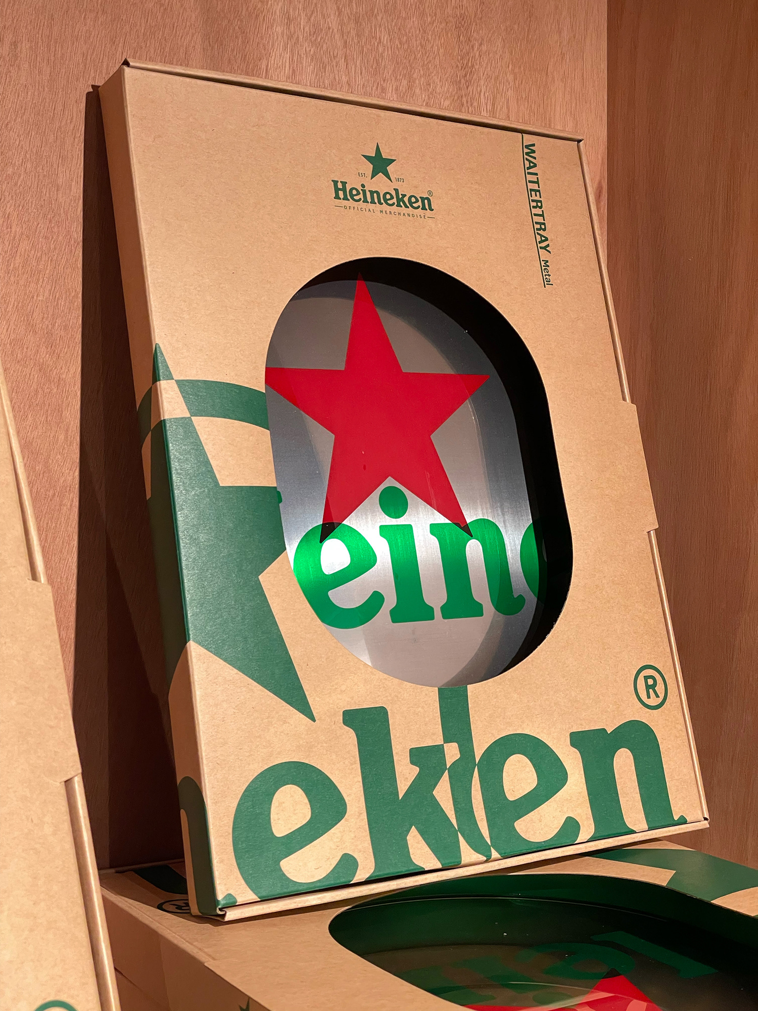
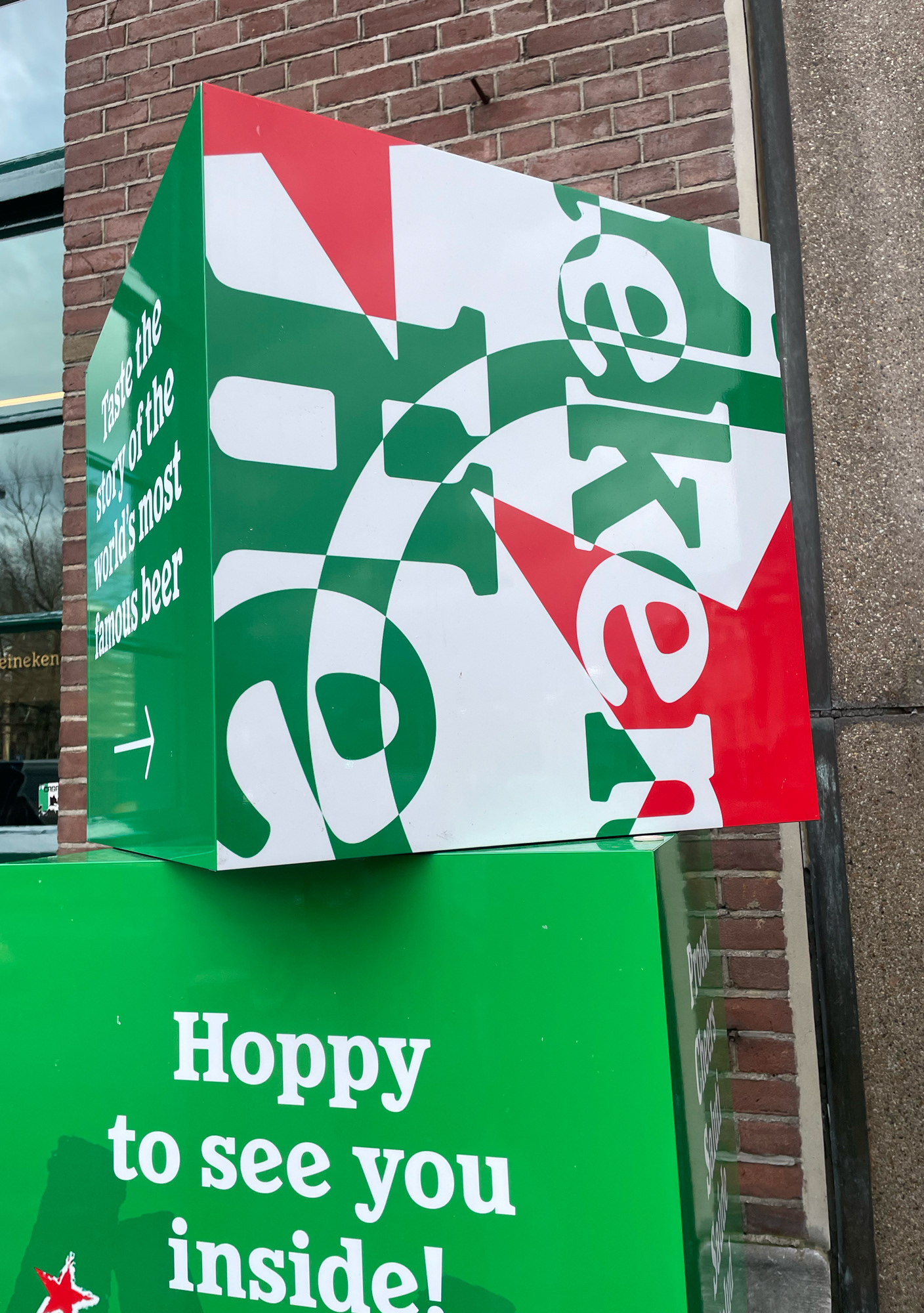
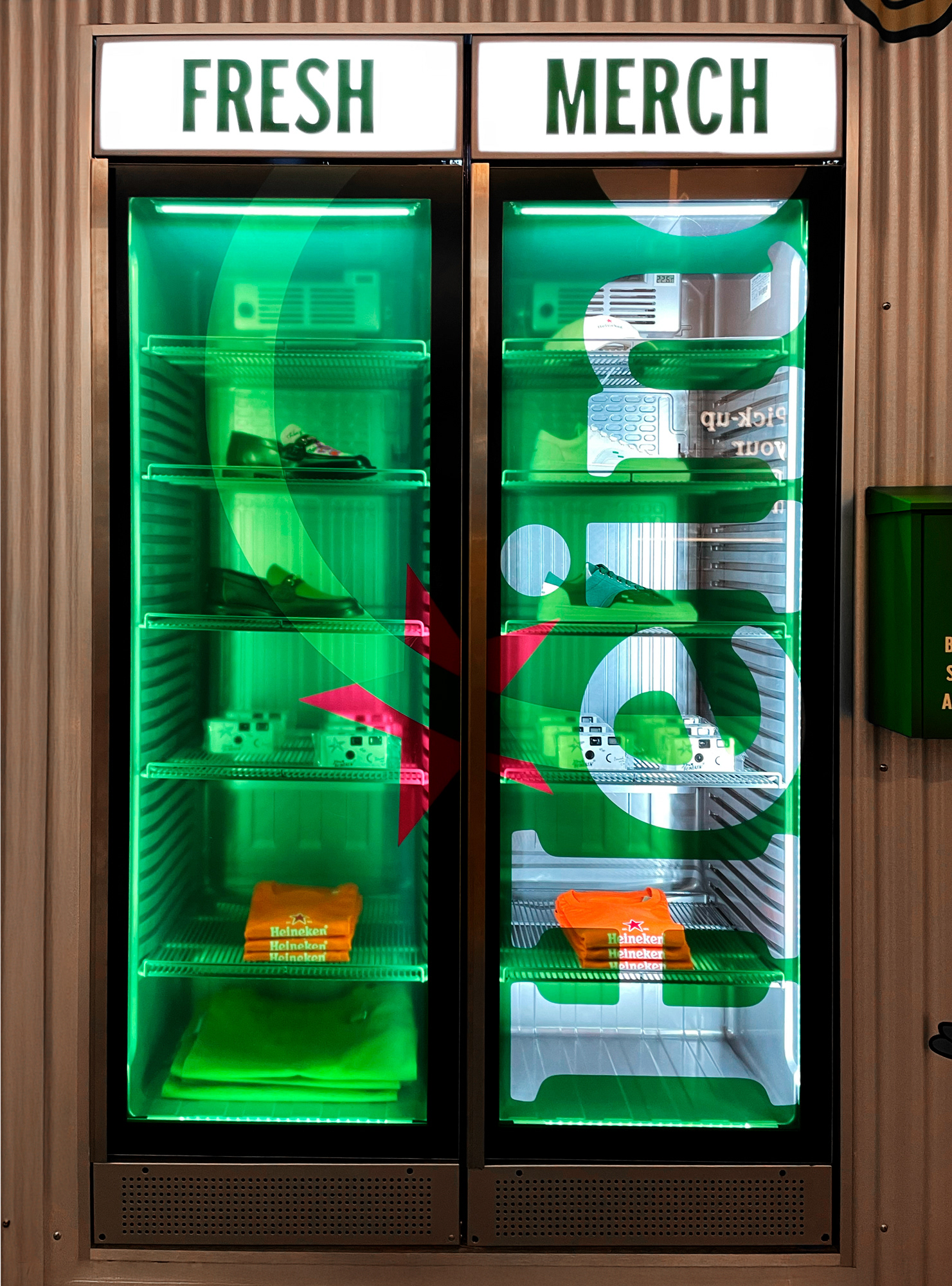
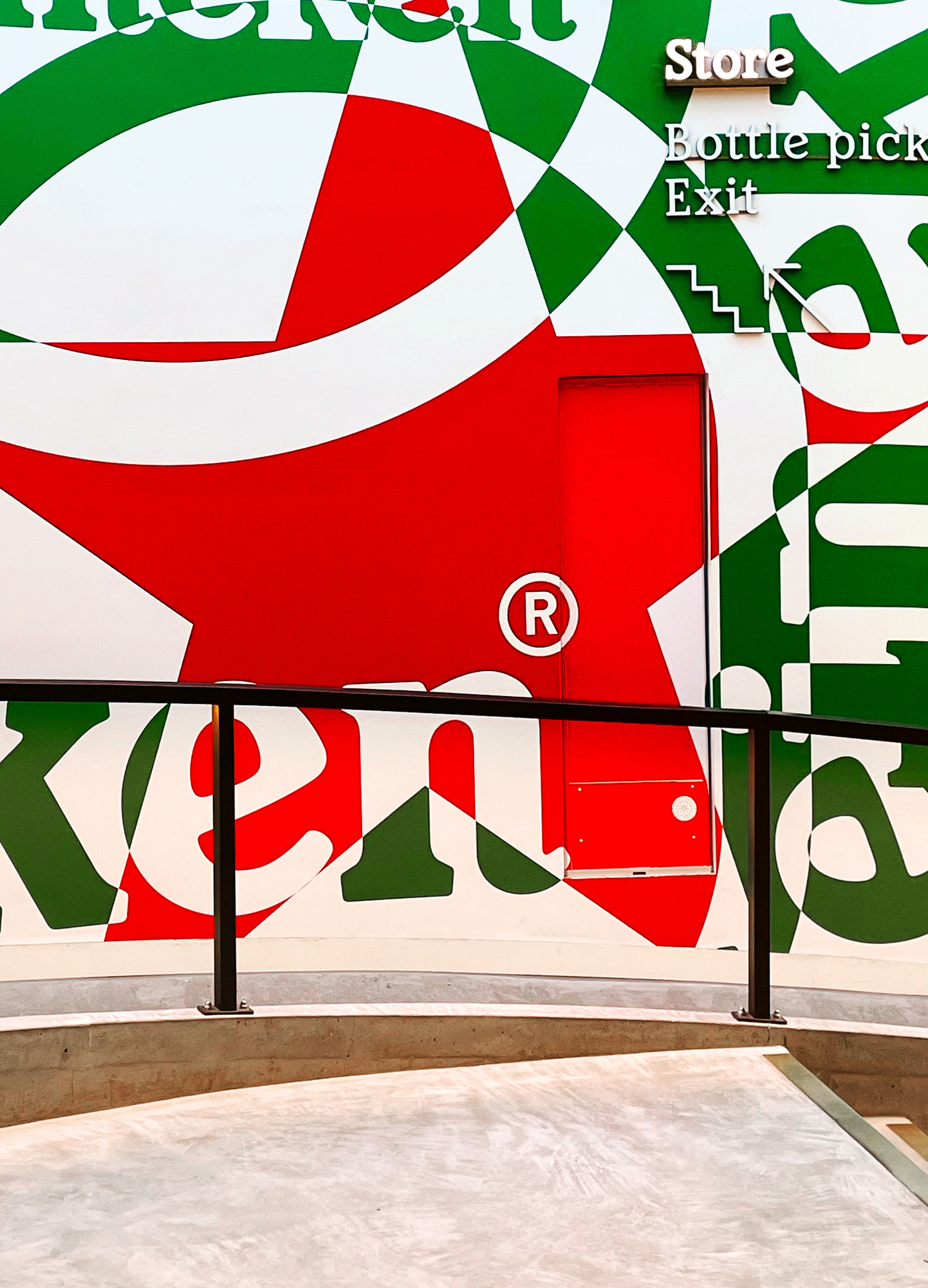
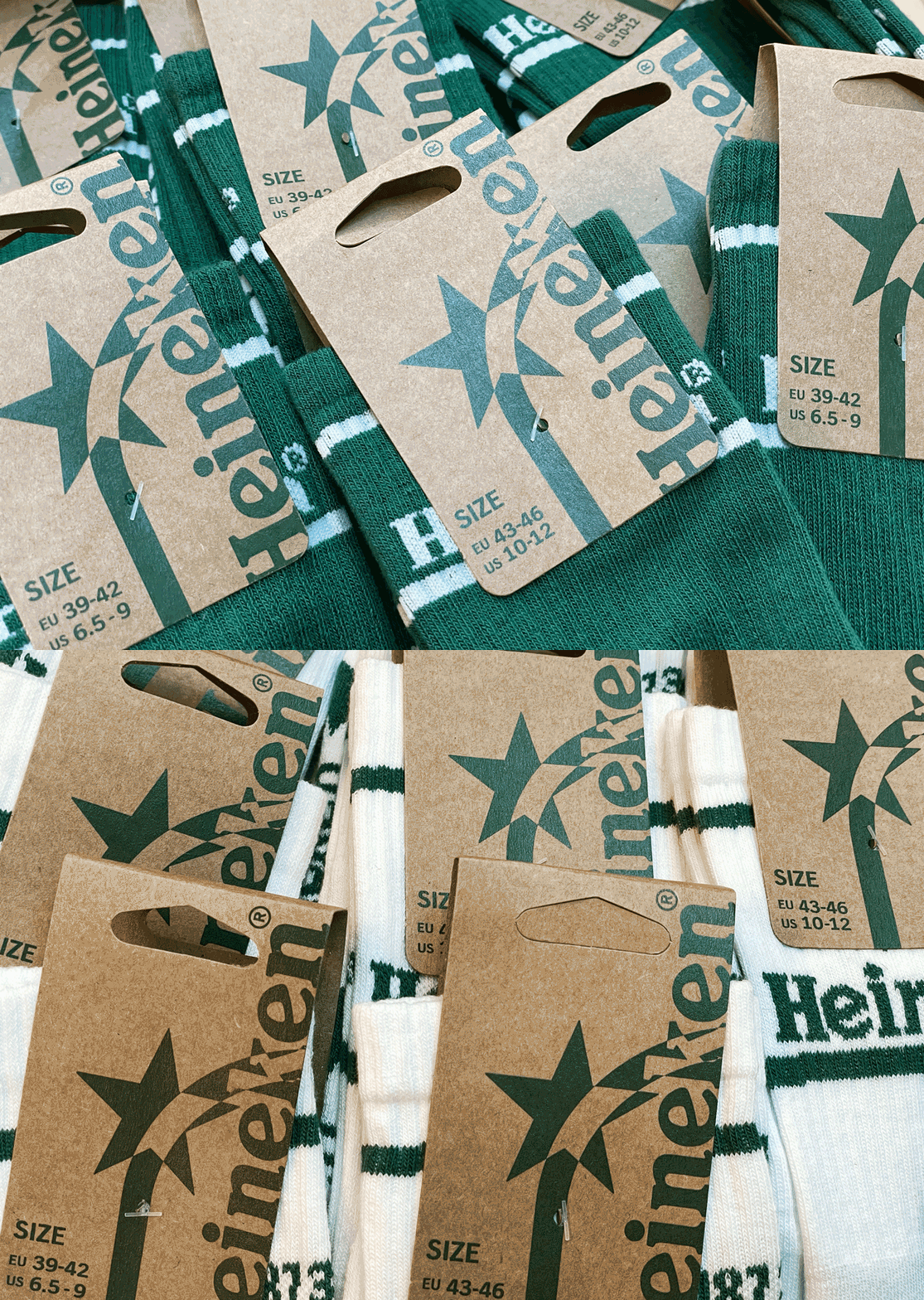
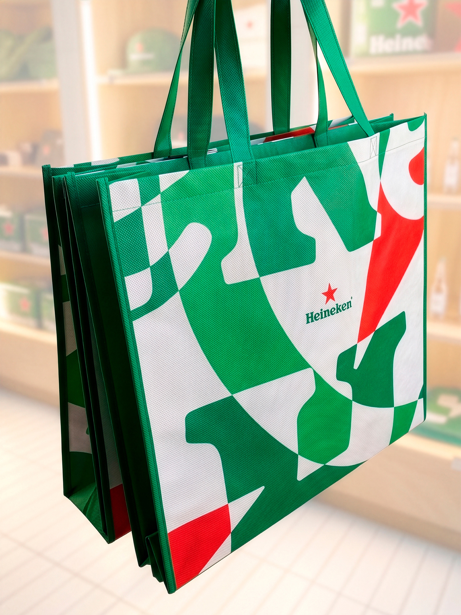
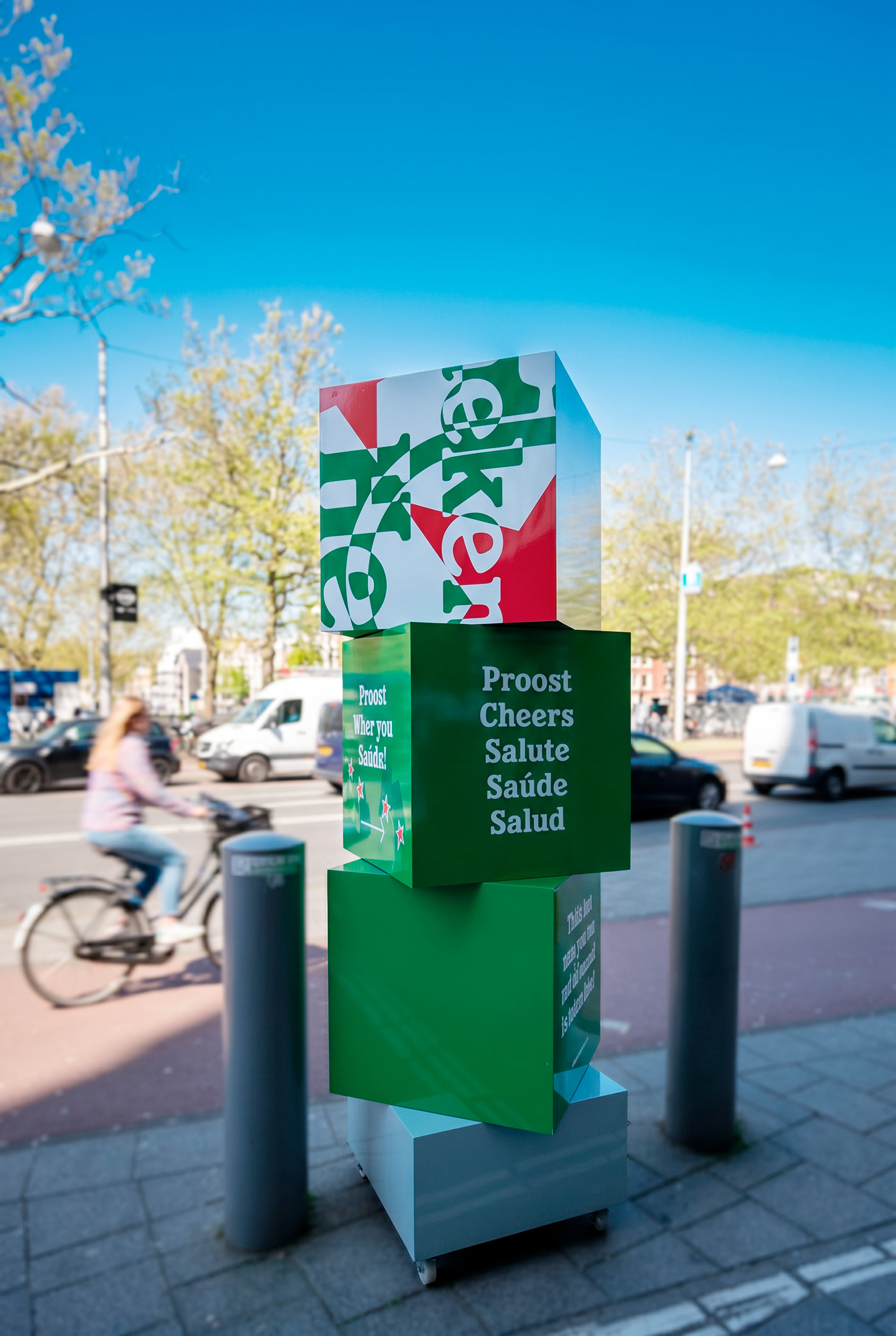
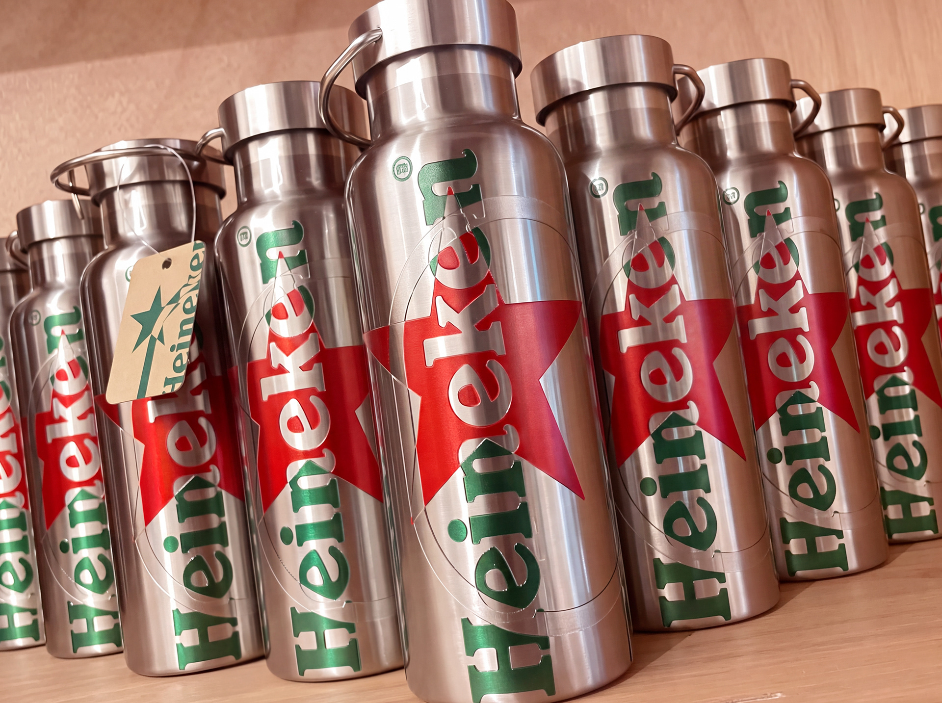
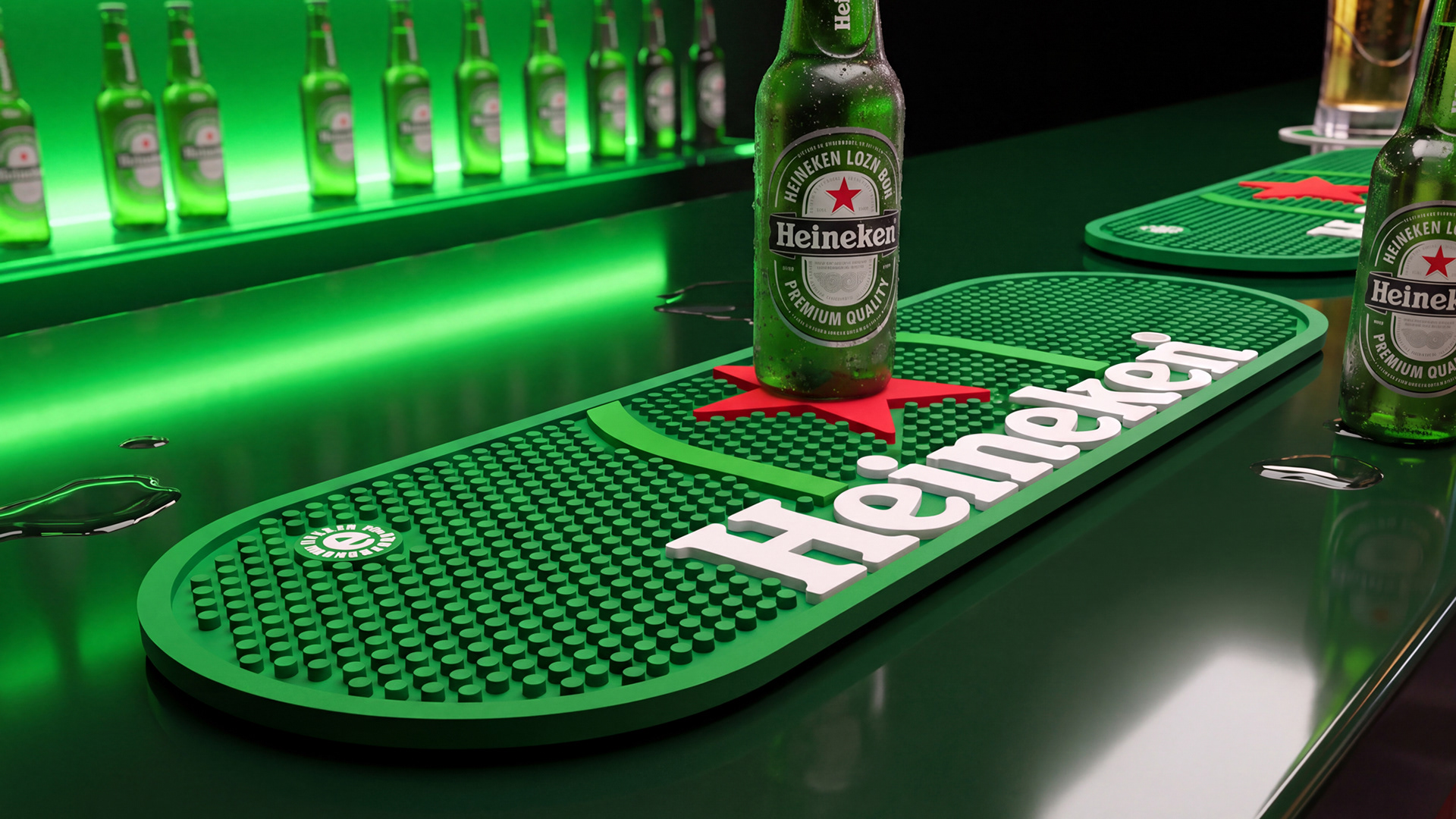
While close to the product Heineken remains unmistakably Heineken, further into the experience, a more dynamic visual language brings new energy, freshness and engagement to the brand.
While close to the product Heineken remains unmistakably Heineken, further into the experience, a more dynamic visual language brings new energy, freshness and engagement to the brand.
CREDITS
The Heineken Company:
Mark Van Iterson - Global Director Design
CAROLINE VAN HOFF - Senior BRAND DESIGN MANAGER
Design Bridge and Partners:
fabio milito - creative director
Giovanni Mattia Pinzani - Design Director
Manuel De Simone - Senior Designer
MERCHANDISE DEVELOPMENT & PRODUCTION: REGGS / KELLERMAN
The Heineken Company:
Mark Van Iterson - Global Director Design
CAROLINE VAN HOFF - Senior BRAND DESIGN MANAGER
Design Bridge and Partners:
fabio milito - creative director
Giovanni Mattia Pinzani - Design Director
Manuel De Simone - Senior Designer
MERCHANDISE DEVELOPMENT & PRODUCTION: REGGS / KELLERMAN